
WT1 - Please Check And Give Me Advice
Topic: The graph below shows average carbon dioxide (CO2) emissions per person in the United Kingdom, Sweden, Italy and Portugal between 1967 and 2007. Summarise the information by selecting and reporting the main features, and make comparisons where relevant.
My essay:
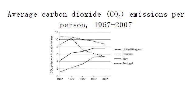
The line graph compares the average amount of carbon dioxide released per person in 4 European countries over a period of 40 years.
It is noticeable that United Kingdom by far let out the most carbon dioxide over the period shown. Portugal released the relatively low quantity of carbon dioxide in each year.
In 1967, United Kingdom was the only country whose carbon dioxide emissions surpassed 10 metric tonnes. Sweden released twice as much carbon dioxide as Italy did, while Portugal produced quite small amount of carbon dioxide. Just a decade later, the carbon dioxide emissions in Sweden exceeded 10 metric tonnes and reached its peak.
Between 1967 and 2007, carbon dioxide emissions in United Kingdom declined slowly and steadily to a bottom of about 9 metric tonnes. By contrast, the figure for Sweden and Portugal rose rapidly to approximately 8 and 5 metric tonnes respectively. After reaching its peak in 1977, the release of carbon dioxide in Sweden plunged dramatically, and by 2007, it had reduced to close to 5 metric tonnes.
Top answer
) European countries over a period of 40 years. (Which 40 years? Which countries?
- ) European countries over a period of 40 years.
- (Which 40 years?
- Which countries?
- You have not given enough information about the graph to the reader.
- ) It is noticeable that (Those words do not describe the figure.
Get the Weekly English Kit 📬
New words, one handy idiom, and a 2-minute quiz — delivered to your inbox to keep your streak alive.
The line graph compares the average amount of carbon dioxide released per person in 4 four (If a value is not a data point, and a small number, write it in words.) European countries over a period of 40 years. (Which 40 years? Which countries? You have not given enough information ab
 Related Questions