
WT1 - PIE CHART
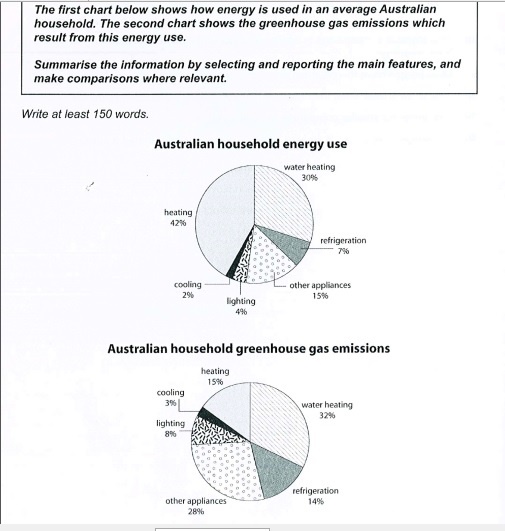
The first pie chart compares the five uses of energy in Australian households, and the second pie chart points out the proportion of greenhouse gas emissions from each energy use.
It is clear that most of energy was used for heating and water heating. However, water heating and other appliances released by far the most gas emissions from their uses.
Heating accounted for 42% of energy used in an Australian home, however, it resulted in only 15% of gas emissions overall. In contrast, the other four uses of energy all accounted for a higher proportion of released gas. 30% of consumed energy was used to heat the water, which was 2% lower than the percentage of gas it produced.
The third most consuming energy use was refrigeration, with about 7%, which released the double proportion of gas. Despite accounting for a merge 15% of household energy use, other appliances produced the highest proportion of gas emissions. The figures for consumed energy by other purposes was followed by the figure for cooling and lighting, with 2% and 4% respectively, which were also responsible for the minority of the gas produced.
Please give me some comments if there is any errors.
Top answer
The first pie chart compares the percentages of five different uses of energy (heating, cooling, water heating, lighting, other appliances and refrigeration) in Australian households, and the second pie chart points out gives the proportion percentages of greenhouse gas emissions from each energy usage type. It is clear that M ost of (missing word) energy (seventy-two percent) was used for two categories: heating and water heating. However, water heating and other appliances released by far the most gas emissions from their uses .
- The first pie chart compares the percentages of five different uses of energy (heating, cooling, water heating, lighting, other appliances and refrigeration) in Australian households, and the second pie chart points out gives the proportion percentages of greenhouse gas emissions from each energy usage type.
- It is clear that M ost of (missing word) energy (seventy-two percent) was used for two categories: heating and water heating.
- However, water heating and other appliances released by far the most gas emissions from their uses .
- (60%).
- Heating accounted for 42% of energy used in an Australian hom e, (comma splice error) however, it resulted in only 15% of (missing word) gas emissions overall.
Get the Weekly English Kit 📬
New words, one handy idiom, and a 2-minute quiz — delivered to your inbox to keep your streak alive.
The first pie chart compares the percentages of five different uses of energy (heating, cooling, water heating, lighting, other appliances and refrigeration) in Australian households, and the second pie chart points out gives the proportion percentages of greenhouse gas emissions from each
 Related Questions