
(WT1 10.10) Please help me by checking this essay.
Please help me by checking this essay. Thank you so much!!!
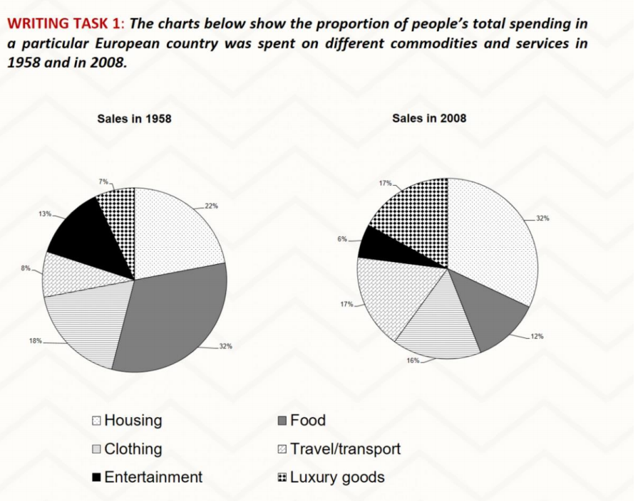
The pie charts give data about the annual expenditure on six different categories including Housing, clothing, Entertainment, Food, Transport and Luxury goods in the two years 1958 and 2008 in a particular Europe country.
Overall, while the majority money was spent on food in 1995, housing held the largest share out of 6 categories for the next 50 years.
There was a general issue in the spending of residents on housing, luxury goods and Travel or transport. From the rank at 22% in 1950, the amount of money used for housing witnessed a sharp increase by 10%- one-third in total. Similarly, a growth by 10% can also be seen in the figure of both luxury goods and transport, accounting for 7% and 8% respectively in the first year, reaching the same point at 17%.
In contrast, people’s spending on food, clothing and entertainment saw a decrease while 32% of total spending used for food deteriorated considerably to 12%, a difference of 20%. The percentage of money spend on entertainment halved from 13 to 6%. A small decline was applied to clothing when it went down by over 2%, to 16% in the last year shown.
Top answer
The pie charts give data about compare the annual expenditure on six different categories , namely including h ousing, clothing, e ntertainment, f ood, t ransport and l uxury goods in the two years 1958 and 2008 in a particular Europe country. Overall, while the majority money the most money was spent on food in 1995, 1958, housing held the largest share out of the six given categories for the next [ what happened in between those years is not given] 50 years later . There was a general issue in the spending of residents on housing, luxury goods and Travel or transport [ I don't understand that] .
- The pie charts give data about compare the annual expenditure on six different categories , namely including h ousing, clothing, e ntertainment, f ood, t ransport and l uxury goods in the two years 1958 and 2008 in a particular Europe country.
- Overall, while the majority money the most money was spent on food in 1995, 1958, housing held the largest share out of the six given categories for the next [ what happened in between those years is not given] 50 years later .
- There was a general issue in the spending of residents on housing, luxury goods and Travel or transport [ I don't understand that] .
- From the rank at a starting point of 22% of total expenditure in 1950, the amount of money used for housing witnessed a sharp notable increase by 10%- one-third in total.
- to one third of all spending in 2008.
Get the Weekly English Kit 📬
New words, one handy idiom, and a 2-minute quiz — delivered to your inbox to keep your streak alive.
The pie charts give data about compare the annual expenditure on six different categories, namely including housing, clothing, entertainment,
 Related Questions