
Writting task 1. can you give me the sample plz
The bar charts reflect the radios related to the world’s oil intakes took place in distinct zones when the other gives the percentages of the oil consumption per year in the same places
Overall, Middle East was the highest source of oil, reached a half of total intake and had huge different compared to the others. While another chart reveals Asia and U.S consumed the most oil yearly
In detail, majority of areas had wide disparity in oil resources between and the rest of sectors. Canada accounted for 14,84% which was the second highest and almost less than Middle East fifth times (56,52%). Nevertheless, the figures of Australia with New Zealand and other regions were 0,3% and 1,08% respectively, which was considered the lowest rates
In the second bar chart, despite having minor intake, the annual consumption of Asia and the U. S were sizable with 26,21% and 25,48%. Whereas, the number of Australia and New Zealand not only had tiny sources but also the utilization was the least, approximately 1,31%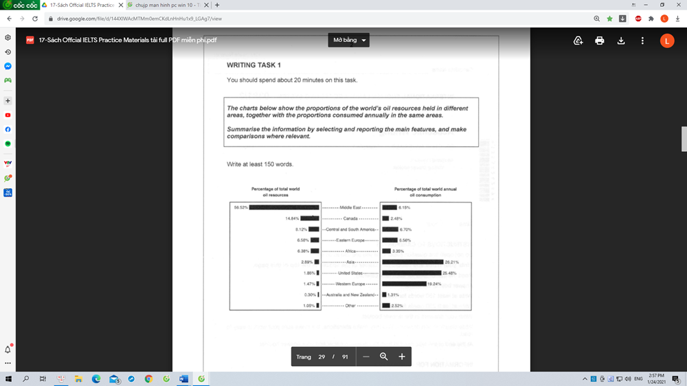
Top answer
1- Simplify your sentences and pay attention to your vocabulary -- "radios" and "ratios" are not the same thing. 2- Attach a larger/clearer image of that diagram.
- 1- Simplify your sentences and pay attention to your vocabulary -- "radios" and "ratios" are not the same thing.
- 2- Attach a larger/clearer image of that diagram.
Get the Weekly English Kit 📬
New words, one handy idiom, and a 2-minute quiz — delivered to your inbox to keep your streak alive.
1- Simplify your sentences and pay attention to your vocabulary -- "radios" and "ratios" are not the same thing.
2- Attach a larger/clearer image of that diagram.
 Related Questions