
Writing task 1 - Unemployment and owning a home
The table and chart provide information about unemployment and owning a home in selected European countries.
Summarise the information by selecting and reporting the main features, and make comparisons where relevant.
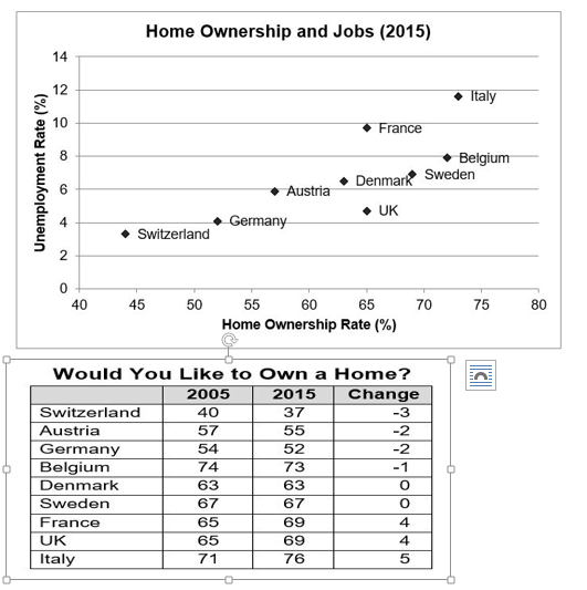
The graph shows data about the joblessness rate, the proportion of home owners in 2015 and the percentage of people who desire to own a home between 2005 and 2015 in eight European countries.
Overall, all selected European countries had the low rate of idleness and many citizens had their own home in 2015. Italy had the highest levels of unemployed, home owners, and the majority of Intalian desire their own home through the period of ten years.
In 2015, the joblessness rate increased with the rate of home ownership in selected European countries, apart from France and the UK. The unemployment rate was the highest in Italy, at 12%, and around 74% of Italian owned a home. In contrast, Switzerland only had under 4% of joblessness, and 44% of home owners. While France and the United Kingdom had the same rate of home ownership with 65%, almost 10% of joblessness in France compared to only around 4.9-5% in the UK.
74% of Belgian and 71% of Italian stood in need owning a home in 2005. After ten years, the figure for Belgium fell by 1% while it for Italy slightly increased to 76%. The porprotion of Danish and Swede who hope for their own home remained over the period, at 63% and 67% respectively.
Top answer
This is a very difficult task. It is easy to fall into the trap of drawing conclusions about some underlying relationship between unemployment rate and home ownership. ) shows data about the joblessness rate, the proportion of home owners in 2015 and the percentage of people who desire to own a home between 2005 and 2015 in eight European countries.
- This is a very difficult task.
- It is easy to fall into the trap of drawing conclusions about some underlying relationship between unemployment rate and home ownership.
- ) shows data about the joblessness rate, the proportion of home owners in 2015 and the percentage of people who desire to own a home between 2005 and 2015 in eight European countries.
- (That is incorrect.
- The graph does not show that.
Get the Weekly English Kit 📬
New words, one handy idiom, and a 2-minute quiz — delivered to your inbox to keep your streak alive.
This is a very difficult task. It is easy to fall into the trap of drawing conclusions about some underlying relationship between unemployment rate and home ownership.
The graph (What kind of graph is this?) shows data about the joblessness rate, the proportion of home owners in 2015 and the percentage of people who desire to own a ho
 Related Questions