
Writing task 1: The main sources of energy
The pie charts give information about the proportion of five different sources of energy in the USA: oil, natural gas, coal, hydroelectric power and nuclear power between 1980 and 1990. It is noticeable that the amount of oil-consuming decreased and that of hydroelectric power still maintained. By contrast, there was a significant growth in the amount of coal and nuclear power using as one of the main sources.
Oil consumption accounted for 42% in 1980. Despite its dramatic decreasing to 33%, oil was still has a good proportion in 1990. The percentage of natural gas-consuming also saw a slight decline but only decreased from 26% to 25%. That of hydroelectric power remained at 5% after ten years.
On the other hand, the proportion of using nuclear power was similar to the percentage of hydroelectric power in 1980, at exactly 5 percent. This then made up about 10% in 1990 while the rate of coal-using grew from almost a fifth to just under a third.
I appreciate all your feedback!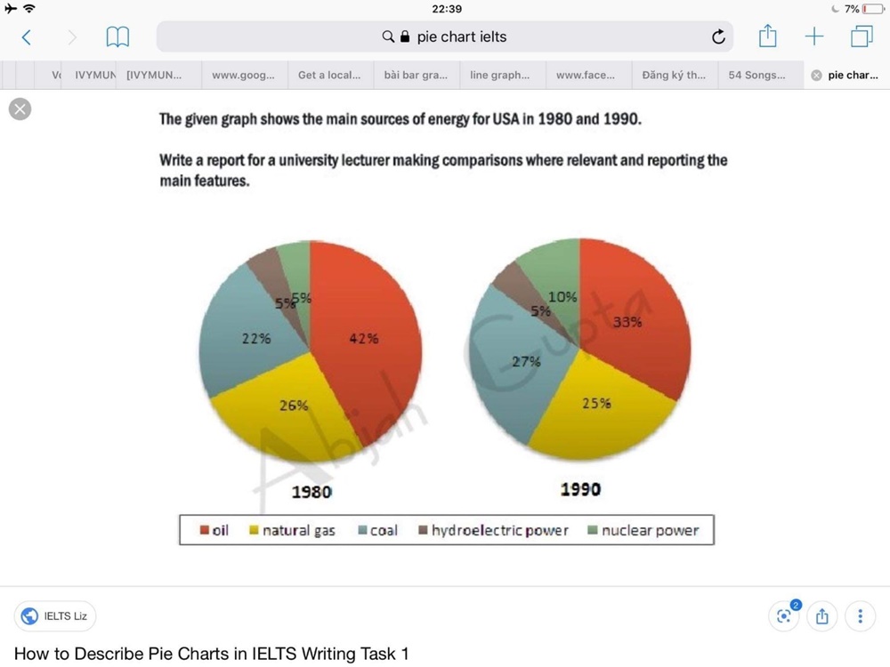
Top answer
) pie charts give information about ("Information about" is vague. ) the proportion of five primary different sources of energy in the USA: oil, natural gas, coal, hydroelectric power and nuclear power between 1980 and 1990. It is noticeable that the amount (wrong word.
- ) pie charts give information about ("Information about" is vague.
- ) the proportion of five primary different sources of energy in the USA: oil, natural gas, coal, hydroelectric power and nuclear power between 1980 and 1990.
- It is noticeable that the amount (wrong word.
- ) of oil-consuming (unnatural) decreased and that of hydroelectric power still maintained .
- (unnatural) By contrast, there was a significant growth in the amount of coal and nuclear power using as one of the main sources.
Get the Weekly English Kit 📬
New words, one handy idiom, and a 2-minute quiz — delivered to your inbox to keep your streak alive.
The (How many?) pie charts give information about ("Information about" is vague. Be more specific about exactly what is shown on the pie charts.) the proportion of five primary different sources of energy in the USA: oil, natural gas, coal, hydroelectric power and nuclear power between 1980 and 1990. It is notic
 Related Questions