
Writing task 1. Please review my Ielts essay
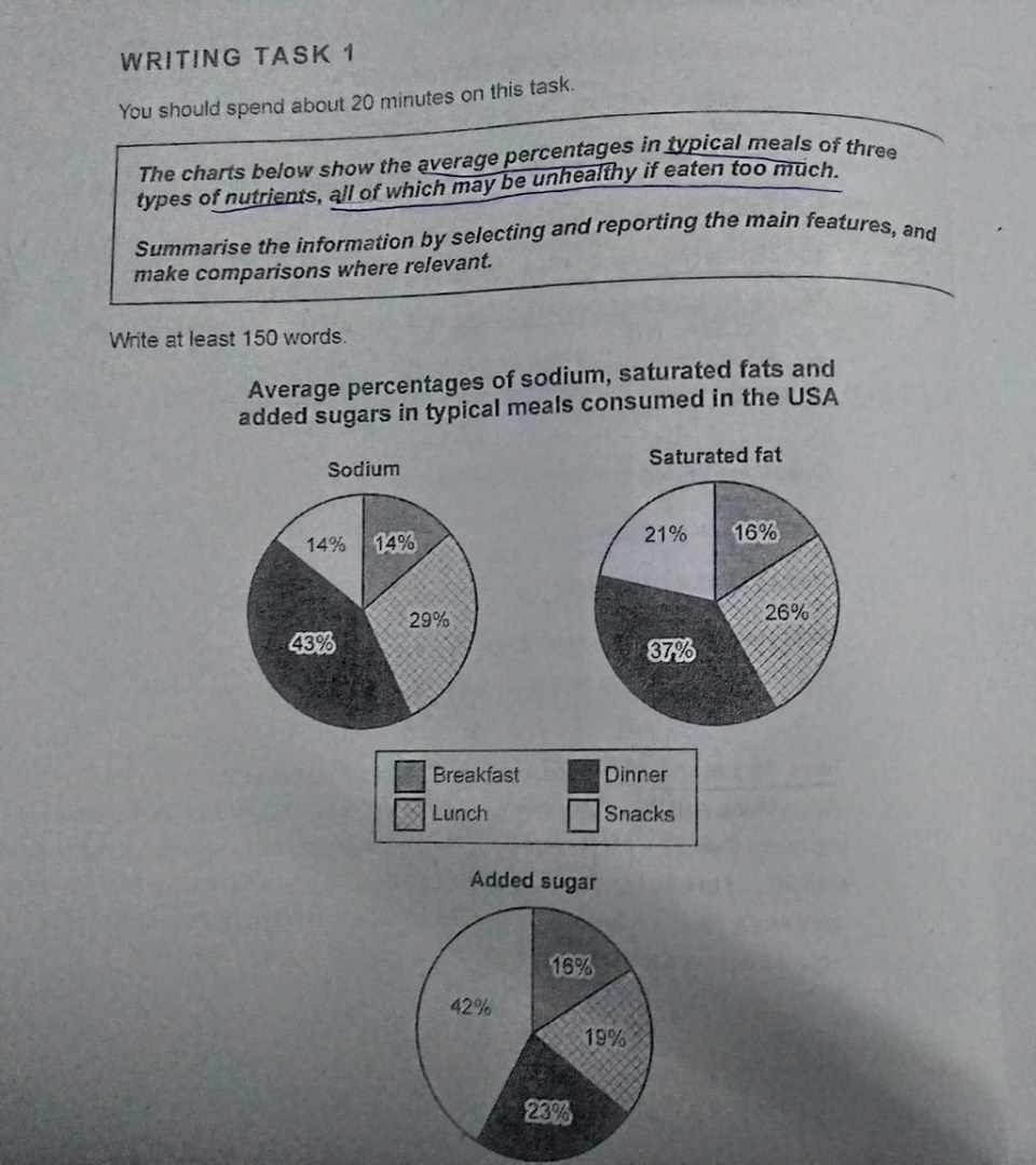
The three pie charts represent the average percentages of three kinds of nutrients which are included in the daily meals of consumers in America. All of these are supposed to be unhealthy and harmful if people overeat.
Overall, the given charts show that sodium, saturated fat, and added sugar make up a large amount in meals. However, it seems that the Americans have healthier dishes in their first and second meal because they contain a lower percentage of these nutrients.
In the first chart, it is shown that nearly a half of sodium is contained in dinner whereas there is just 14% in both breakfast and snacks. Also, sodium modestly appears in lunch at about one-third.
In terms of saturated fat, more than one out of three is composed in dinners, higher than around a fifth in snacks. Moreover, 26% and 16% of this nutrient emerge in breakfast and lunch respectively.
Finally, added sugar is a particularly necessary nutrient for fast and junk foods in the USA in which is up to 42%, in contrast to only 16% in breakfast. Surprisingly, while dinner is an essential meal that consists of large amounts of sodium and fat, there is moderately around a quarter of sugar in it.
Top answer
The three pie charts represent (wrong word. A salesman represents his company. Our elected officials represent us in government.
- The three pie charts represent (wrong word.
- A salesman represents his company.
- Our elected officials represent us in government.
- ) the average percentages of three kinds of nutrients which are included in the daily meals of consumers in America ns .
- All of these are supposed to be unhealthy and harmful if people overeat.
Get the Weekly English Kit 📬
New words, one handy idiom, and a 2-minute quiz — delivered to your inbox to keep your streak alive.
The three pie charts represent (wrong word. A salesman represents his company. Our elected officials represent us in government. ) the average percentages of three kinds of nutrients which are included in the daily meals of consumers in Americans. All of these are supposed to be unhealth
 Related Questions