
Writing task 1. please helps me repair and tks a lot
The pie chart demonstrate how much average household is expenditure between japan and Malaysia in the year 2010. Looking at the pie chart. It is immediately obvious that housing register the highest figure and the rate of expenditure on health care was smallest in Malaysia compared to Japan. In Japan. The percentage of expenditure on other goods and services was highest, at 29% , while the figure for fodd was slightly lower, at 24%. 21% of the total spending on housing, compared to 6% on health care. Meanwhile transport made up 20% of the total. In Malaysia . The rate of out going on housing went up by 13% to 34% and became the highest rate in pie chart. Besides there was a slight decrease in the rate of spending on food by 3% to 27%. In addition there were sharp downward to 3% and 10% of spending on health care and transport respectively. Other good and services’s insignificantly fell by 3% to 26 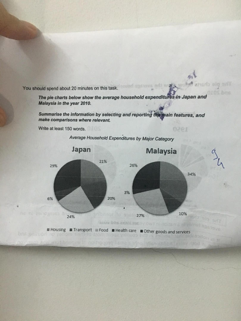
Top answer
Hi Vermus, and welcome to the forum. That image is not very clear. g.
- Hi Vermus, and welcome to the forum.
- That image is not very clear.
- g.
- "Ho" for housing) next to the numbers please?
Get the Weekly English Kit 📬
New words, one handy idiom, and a 2-minute quiz — delivered to your inbox to keep your streak alive.
Hi Vermus, and welcome to the forum. 
That image is not very clear. Can you post the colour version (if you have it), or a
 Related Questions