
Writing task 1. please help me
The line charts provide a breakdown of pollution in London, consist of smoke and diodioxide which micrograms per cubic metre.
Looking at line charts, it is immediately obvious that the higher levels of sulphur dioxide than smoke in the atmosphere and over changed each period.
In 1600, the pollution levels were low. After a time, exactly was between 1700 and 1750, the quantity of sulphur dioxide level was increase, at 750 micrograms per cubic metre, while the figure for smoke pollution was significantly lower, at 200 micrograms per cubic metre.In addition, the pollution levels continued to rise .In 1850 , the sulphur dioxide level was rose dramatically , around 850 micrograms per cubic metre and it became a highest level in charts. In addition, the smoke level reached a new peak of it, about 500 in 1900. During the 20th century, the levels of both pollution suddenly began to fall, although there was a short period of fluctuation within this fall.
To sum up. Clearly air pollution was a bigger problems in London in the early 20th century than it is now.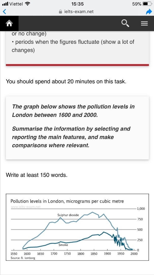
Top answer
The line chart compares the change in charts provide a breakdown of pollution levels caused by smoke and sulphur dioxide in London, consist of smoke and diodioxide which in micrograms per cubic metre, over a period of almost 500 years starting in the late 1500s. Looking at the line char t , it is immediately obvious that the higher levels of sulphur dioxide than of smoke contributed to pollution in the atmospher e, and over changed each both graphs gradually rose and fell over the given period. In 1600, the pollution levels were low , and the figure was no more than 50 micrograms per cubic metre for each pollutant.
- The line chart compares the change in charts provide a breakdown of pollution levels caused by smoke and sulphur dioxide in London, consist of smoke and diodioxide which in micrograms per cubic metre, over a period of almost 500 years starting in the late 1500s.
- Looking at the line char t , it is immediately obvious that the higher levels of sulphur dioxide than of smoke contributed to pollution in the atmospher e, and over changed each both graphs gradually rose and fell over the given period.
- In 1600, the pollution levels were low , and the figure was no more than 50 micrograms per cubic metre for each pollutant.
- After a time, exactly was However between 1700 and 1750, the quantity figure for of sulphur dioxide level was increase d at and reached just over 750 micrograms by 1725.
- per cubic metre, Mean whil e, the figure for smoke pollution also rose but was significantly lower, at 200 micrograms per cubic metre in the same year .
Get the Weekly English Kit 📬
New words, one handy idiom, and a 2-minute quiz — delivered to your inbox to keep your streak alive.
The line chart compares the change in charts provide a breakdown of pollution levels caused by smoke and sulphur dioxide in London, consist of smoke and diodioxide which in micrograms per cubic metre,
Vermus .BigdreamTo sum upOverall,Clearlyit is clear that air pollution wasa bigger problemsat its highest point in London throughout the 1800s.in the early 20th cen
 Related Questions