
Writing task 1. Please check and mark my writing. thank you!
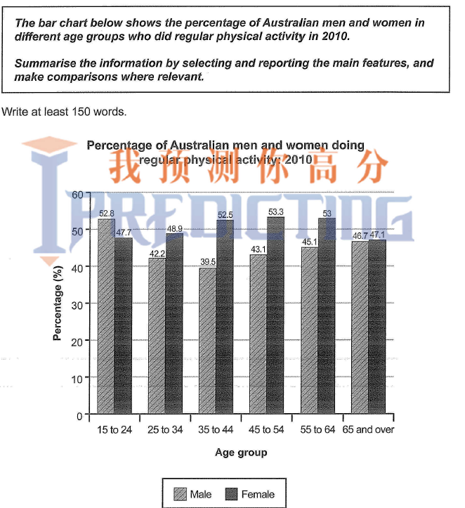
The graph compares the rate of people who do physical activity usually between six separate age groups in both genders in Australia in 2010.
Overall, in 5 of the 6 age groups females are outnumbered males. Exception is that in the 15 to 24 years group, the proportion of men often do bodily activity not only more than this figure for women but also was the highest value of the male group in the graph.
If look at details, Australian women at the age of 25 to 54 had percentage rose slightly from 48.9% reached a peak of 53.3% and in 2 last groups after 55 years old women’s data decline dramatically, fell by 6.2% in 65 years and over group. By the contrast, the number of men over 45 improved steadily like 43.1%, 45.1% and 46.7% but still were less than figures for women.
Top answer
htm
- htm
Get the Weekly English Kit 📬
New words, one handy idiom, and a 2-minute quiz — delivered to your inbox to keep your streak alive.
Please post essays in the writing forum:
https://www.EnglishForward.com/English/EssayReportCompositionWriting/Forum9.htm
The graph compares the rate (wrong word) of people men and women who do regular/daily physical activity usually (wrong word order) between (am
The graph compares how many people who traveled by three main British airports over a five-year period between 1998 and 2003. The units are measured in millions of travelers per year.
Overal, what can be seen from the graph is that there are upward trends in the numbers of visitors of all three airports over the period in question. General, Gatwick airport was the leader which often had
 Related Questions