
WRITING TASK 1- PIE CHART
The pie charts below the comparison of different kinds of energy production of France in two years
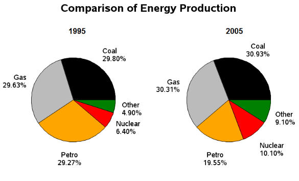
The graph outlines the percentage of five different types of energy generated in France in 1995 and 2005.
Overall, gas, coal, and petrol were the dominant features, while nuclear and others are produced less in the country. Furthermore, after 10 years, all figures increased but petrol, which saw a minimal decline.
The highest in both years was coal, whose percentage accounted for 29,3% in 1995 and merely rose in 2005. Likewise, gas occupied for approximately a third of the energy generation. Regarding the remaining components, there was a slight growth, around 5%, in the ratios of nuclear and others.
On the other hand, petrol was the only category that underwent a fall after a decade. The French produced 10% less petrol in 2005 than they did in 1995, resulting in a decrease from 29,27% to 19,55%. However, petrol remained in third place, just after the production of coal and gas in both 1995 and 2005.
Top answer
Please read my advice for Task 1 essays. IELTS TASK 1: Hints, Tips And Advice Vocabulary Words For Task 1: Reference Post The title on your pie chart is ungrammatical, that is very poor English. The example exercise is not good.
- Please read my advice for Task 1 essays.
- IELTS TASK 1: Hints, Tips And Advice Vocabulary Words For Task 1: Reference Post The title on your pie chart is ungrammatical, that is very poor English.
- The example exercise is not good.
- Do not use this site or source for your practice essays.
- It will only confuse you.
Get the Weekly English Kit 📬
New words, one handy idiom, and a 2-minute quiz — delivered to your inbox to keep your streak alive.
 Related Questions