
Writing task 1 pie chart
The given pie charts compare the expenses in 7 different categories in 1966 and 1996 by American Citizens.
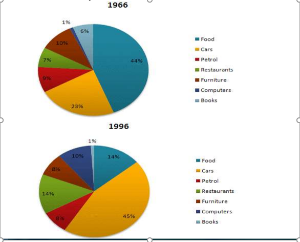
The two pie charts illustrate the percentage of American residents’ spending on 7 distinctive items over the 30-year-period from 1966 to 1996.
Overall, while the expense on food, books, furniture, and petrol decreased, spending on cars, Restaurants, and computers increased sharply.
In 1966, food held up the largest proportion of the total expense at 44%, which is twice as much as that of cars. Restaurants and books had the similar figures at 7% and 6% respectively. Moreover, there was little difference between the percentage of petrol and furniture at 9% and 10% in turns. Strikingly, American people only spent 1% of their entire expenditure on buying computers.
After 30 following years, there was a profound shift. The proportion of spending which American citizens spent money on purchasing private cars is 45%, making it highest in the chart. Food and books experienced a sharp drop to 1% and 14% in order while the expense on restaurants doubled to 14% by 1996. Petrol and furniture saw a marginal fall and then ended up at the same figure, 8%. it is noticeable that the percentage of the expenditure on computers was ten times as much as that at the beginning.
Top answer
The two pie charts illustrate the percentage of American s' residents’ spending on 7 distinctive items over the 30-year-period (Not quite right. ) from 1966 to 1996. Overall, while the expense (wrong form) on food, books, furniture, and petrol decreased, spending on cars, Restaurants, and computers increased sharply.
- The two pie charts illustrate the percentage of American s' residents’ spending on 7 distinctive items over the 30-year-period (Not quite right.
- ) from 1966 to 1996.
- Overall, while the expense (wrong form) on food, books, furniture, and petrol decreased, spending on cars, Restaurants, and computers increased sharply.
- In 1966, food held up the largest proportion of the total expense at 44%, which is twice as much as that of cars.
- Restaurants and books had the similar figures at 7% and 6% respectively.
Get the Weekly English Kit 📬
New words, one handy idiom, and a 2-minute quiz — delivered to your inbox to keep your streak alive.
The two pie charts illustrate the percentage of Americans' residents’ spending on 7 distinctive items over the 30-year-period (Not quite right. It does not show the years in between.) from 1966 to 1996.
Overall, while the expense (wrong form) on food, books
 Related Questions