
WRITING TASK 1-NUMBER 6
Here is my essay. I hope you can spend some time correcting it. Thanks a lot.
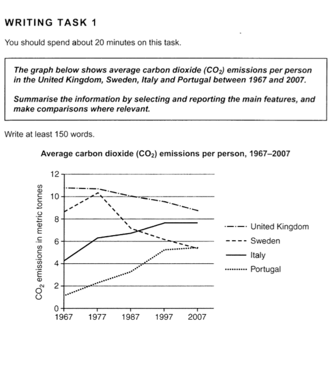
The line chart illustrates how many tonnes of carbon dioxide one person emitted on average in four different countries over a period of 40 years, starting from 1967. Overall, the amount of carbon dioxide emissions showed an upward trend in Portugal and Italy, while a downward trend was seen in the amount of average carbon dioxide emissions in the UK and Sweden. Although the UK emitted the largest amount of CO2 per person throughout the period, there was a dramatic increase in the quantity of carbon dioxide emitted in Sweden.
In 1967, there was about 11 metric tonne of CO2 emissions in the UK, compared to around 9 tonne in Sweden. However, the amount of CO2 per person in the UK showed a steady decline over the given period, ending at about 9 tonne in 2007. Meanwhile, Sweden witnessed a dramatic increase in the average CO2 emissions, reaching a peak of over 10 tonne a decade later. This figure then showed a sharp decrease of 3 tonne in 1987 before declining steadily to around 5 tonne by the end of the period. Starting at over 4 tonne of CO2 emissions in 1967, Italy saw a drastic increase of 2 tonne in the average CO2 emitted per person ten years later. This figure then grew gradually to nearly 8 tonne in 1997, and remained unchanged over the last ten year. Finally, only 1 tonne of CO2 emissions per person came from Portugal in 1967, but increased to about 5 tonne three decades later, and showed no change over the last decade.
Top answer
The line chart illustrates shows how many tonnes of carbon dioxide each one person emitted on average in four different countries over a period of 40 years, starting from 1967. Overall, the amount of carbon dioxide emissions showed an upward trend in Portugal and Italy, while a downward trend was seen in the amount of average carbon dioxide emissions (no need to repeat this) in the UK and Sweden. Although the UK emitted the largest amount of CO2 per person throughout the period, there was a dramatic increase in the quantity of carbon dioxide emitted in Sweden .
- The line chart illustrates shows how many tonnes of carbon dioxide each one person emitted on average in four different countries over a period of 40 years, starting from 1967.
- Overall, the amount of carbon dioxide emissions showed an upward trend in Portugal and Italy, while a downward trend was seen in the amount of average carbon dioxide emissions (no need to repeat this) in the UK and Sweden.
- Although the UK emitted the largest amount of CO2 per person throughout the period, there was a dramatic increase in the quantity of carbon dioxide emitted in Sweden .
- ) In 1967, there was about 11 metric tonne of CO2 emissions per person in the UK, compared to around 9 tonne in Sweden.
- However, the amount of CO2 per person in the UK showed a steady decline over the given period, ending at about 9 tonne in 2007.
Get the Weekly English Kit 📬
New words, one handy idiom, and a 2-minute quiz — delivered to your inbox to keep your streak alive.
The line chart illustrates shows how many tonnes of carbon dioxide each one person emitted on average in four different countries over a period of 40 years, starting from 1967. Overall, the amount of carbon dioxide emissions showed an upward trend in Portugal and Italy, while a downward
 Related Questions