
Writing task 1-mix
The table below shows CO2 emissions for different forms of transport in the European Union. The Pie Chart shows the percentage of European Union funds being spent on different forms of transport.
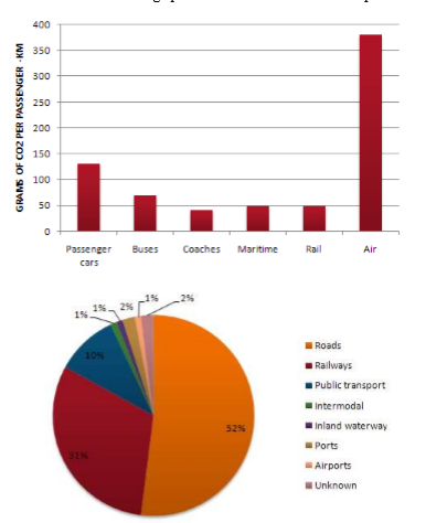
The bar chart illustrates how much the carbon dioxin for each passenger is emitted from 6 distinctive forms of transportation, while the pie chart provides data about the amount of EU’s spending on different types of transport.
Overall, traveling by air is the main source of CO2 discharged into the atmosphere compared to the other forms, and the funding on roads hold up the largest amount of the total expense of transportation.
Looking closely at the bar graph, it can be seen that a single passenger who uses air transport emits around 375grams, making it the largest amount in the chart. By contrast, coaches contribute to the lowest level of emission which is well under 50 grams per one.The second contributor to the emission is passenger cars with 125grams per commuter, over 50 grams greater than that of buses. While maritime and rail discharge the same low amount of CO2 with 50 grams per person.
Regarding the pie chart, the majority of EU’s budget is allocated to improving roads and rails at 52% and 32%, respectively. Whereas, spending on public transportation is just 10%. It is noticeable that only 1 % of expense is spent on intermodal, airport, and railways which is twice as much as that of port and unknown forms at 2%.
Top answer
The table below shows CO2 emissions for different forms of transport in the European Union. The Pie Chart shows the percentage of European Union funds being spent on different forms of transport. The bar chart illustrates how much the carbon dioxin for each passenger (missing words) is emitted by from 6 distinctive forms of transportation, while the pie chart provides data about the amount of EU’s spending on different types of transport.
- The table below shows CO2 emissions for different forms of transport in the European Union.
- The Pie Chart shows the percentage of European Union funds being spent on different forms of transport.
- The bar chart illustrates how much the carbon dioxin for each passenger (missing words) is emitted by from 6 distinctive forms of transportation, while the pie chart provides data about the amount of EU’s spending on different types of transport.
- Overall, traveling by air is the main source of CO2 discharged into the atmosphere (That is probably not a true statement.
- You cannot claim this.
Get the Weekly English Kit 📬
New words, one handy idiom, and a 2-minute quiz — delivered to your inbox to keep your streak alive.
The table below shows CO2 emissions for different forms of transport in the European Union. The Pie Chart shows the percentage of European Union funds being spent on different forms of transport.
The bar chart illustrates how much the carbon dioxin for each passenger (missing words)
 Related Questions