
Writing task 1 - Line Graph
The first graph shows the number of train passengers from 2000 to 2009; the second compares the percentage of trains running on time and target in the period.
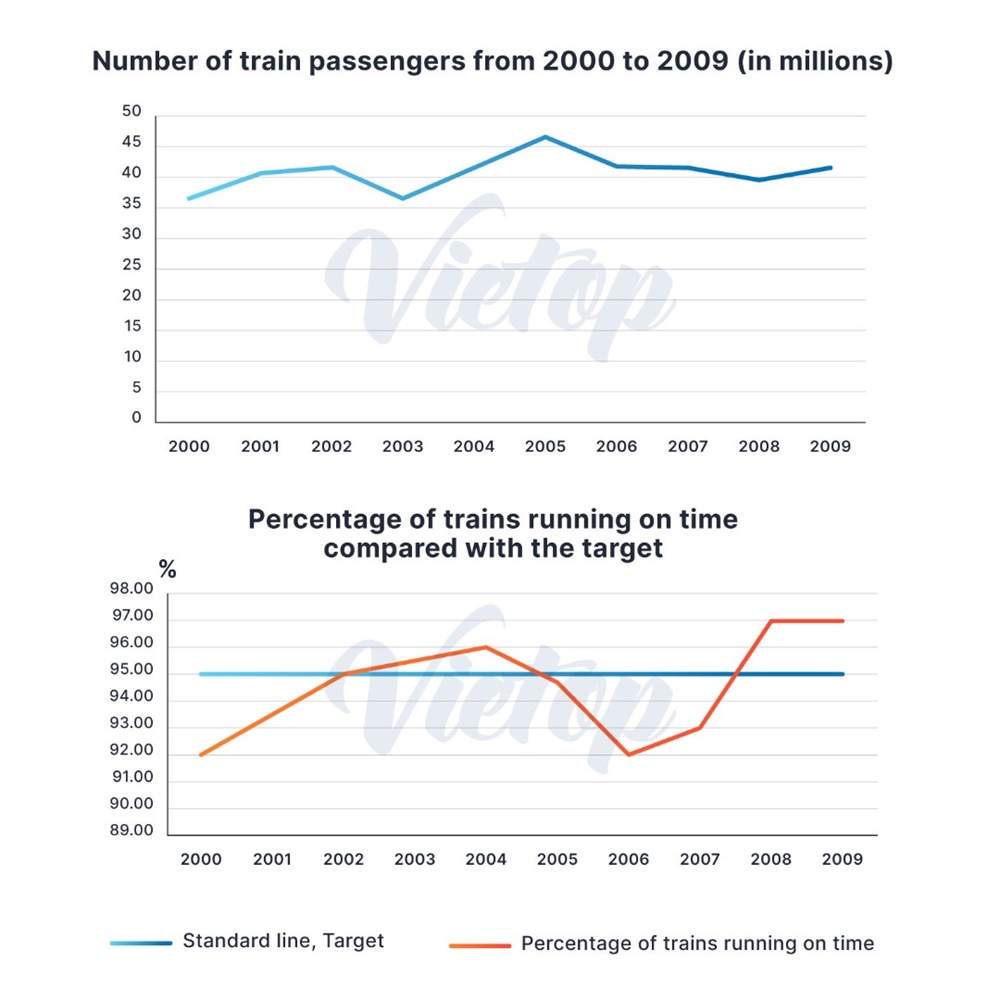
The upper line graph compares the count of travellers using train between 2000 and 2009, and the lower one shows the on-time trains rate, compared to the standard line of 95% in the period.
Overall, both the number of train passgengers and the percentage of on-time trains had an upward trend over the years.
Regarding to the number of train passengers, there was a huge change over the period. After increasing from 35 millions in 2000 to 40 millions in 2001, the count of passengers travelling by train continually rose to around 41 millions in 2002 before suddenly reducing back to the start in 2003. In the next two years, it led the way with about 45 millions. Nonetheless, train passagers experienced a slight fall as 40 millions individuals using train in 2009.
The percentage of trains were on-time changed frequently throughout the period. In the first three years, the on-time trains rate considerably grew from 92% to 95%, which met the target. Although trains running on-time exceeded the expectation, with rocketing to 96% in 2004, it failed to meet the target, at 92% two years later. Besides, the percentage of on-time trains recovered and maintained to approximately 97%.
Get the Weekly English Kit 📬
New words, one handy idiom, and a 2-minute quiz — delivered to your inbox to keep your streak alive.
 Related Questions