
Writing task 1 ; line graph
Please review my writing task 1. Thanks a lot!
Task: The graph below shows the proportion of the population aged 65 and over between 1940 and 2040 in three different countries.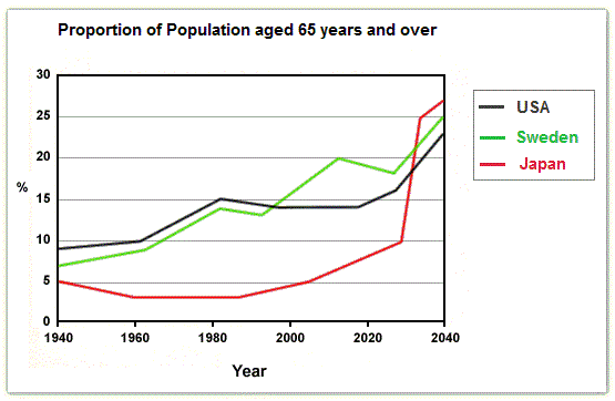
The line chart illustrates the percentage of people aged 65 and over in three different nations over a course of 100 years starting from 1940.
As can be seen from this chart, it is clearly evident that the proportion of elderly people go up in each country over the time frame. Japan is anticipated to observe the most dramatic shifts in its elderly population.
At the beginning of the period, the percentage of population aged 65 and more in USA registered the highest of all three, standing at nearly 10%. This figure rose gradually to approximately 15% in 1990. A similar trend could be seen in the proportion of elder;y people in Sweden, as it increased considerably from 7,5% to nearly 15% over a 50-year period starting from 1940. However, from 1990 to 2030, while the percentage of elderly people in USA has remain relatively unchanged , hovering around nearly 15%, that of Sweden has fluctuated significantly, standing at 17% by 2030. In 2040, this number of USA and Sweden are expected to climb to about 25% and 23% respectively.
Over a course of 60 years starting from 1940, the proportion of elderly people in Japan stabled at below 5%. However, this number has jumped dramatically. In 2040, it is thought to jump to approximately 27%.
Top answer
The line chart illustrates the percentage of people aged 65 and over in three different nations over a course of 100 years starting from 1940. As can be seen from this chart, it is clearly evident that (the word quantity is unnecessary. Use overall only to be concise) the proportion of elderly people go up in each country over the time frame.
- The line chart illustrates the percentage of people aged 65 and over in three different nations over a course of 100 years starting from 1940.
- As can be seen from this chart, it is clearly evident that (the word quantity is unnecessary.
- Use overall only to be concise) the proportion of elderly people go up in each country over the time frame.
- Also, Japan is anticipated to observe the most dramatic shifts in its elderly population in the final 10 years.
- At the beginning of the period, the percentage of population aged 65 and more in USA registered the highest of all three, standing at nearly 10%.
Get the Weekly English Kit 📬
New words, one handy idiom, and a 2-minute quiz — delivered to your inbox to keep your streak alive.
The line chart illustrates the percentage of people aged 65 and over in three different nations over a course of 100 years starting from 1940.
As can be seen from this chart, it is clearly evident that (the word quantity is unnecessary. Use overall only to be concise) the proportion of elderly people go up in each country over the time frame. Also, Japan i
The line chart illustrates the percentage of people aged 65 and over in three different nations over a course of 100 years starting from 1940, with a projection out to 2040.
As can be seen from this chart, it is clearly evident that the proportion of elderly people
 Related Questions