
Writing task 1-line chart
The line chart illustrates the numbers of male and female smokers in someland over the course of 40 years, starting from 1960.
Looking at the graph, it is immediately obvious that there was a significant decrease in the male figure while that of women witnessed an opposite trend.Additionally, more men than women were smoking over the researched period.
As is shown by the graph, approximately 60% of men smoked in 1960, six times as high as that of women. After that, there was an inverse relationship between male and female figure, showing a slight decline in male rate by 10% and a threefold rise in the rate of smoking in women, with 50% for the former and 30% for the latter in 1975. By 2000, both the numbers of smokers in two genders had decreased considerably, but female rate had gone down less sharply. In the end of period, men and women had similar levels of smoking, that is roughly 210 per 1000 people.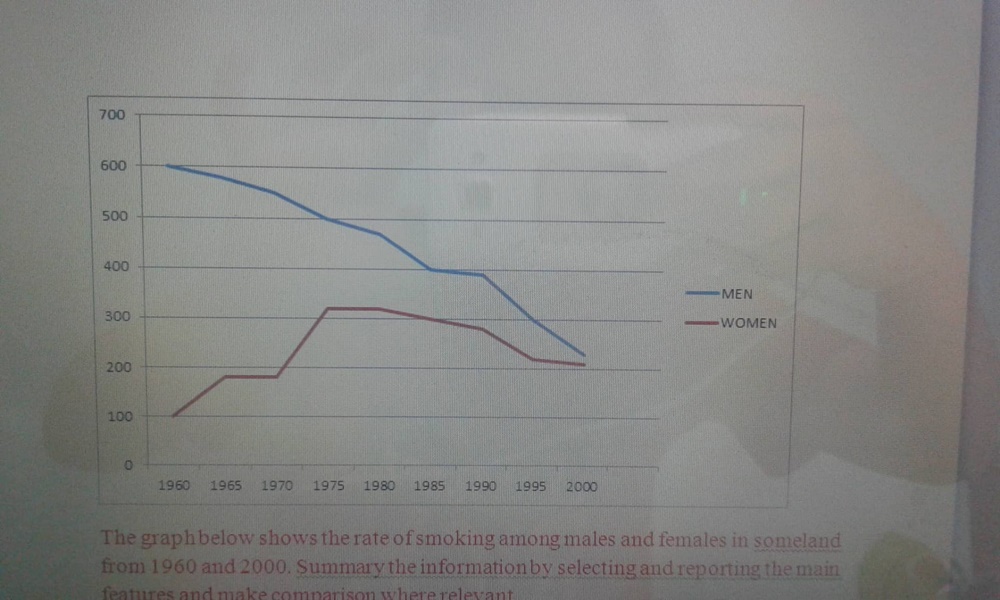
Get the Weekly English Kit 📬
New words, one handy idiom, and a 2-minute quiz — delivered to your inbox to keep your streak alive.
 Related Questions