
Writing task 1 in IELTS exam
I am preparing for the IELTS exam. Please review my report and check my mistakes. Many thanks!
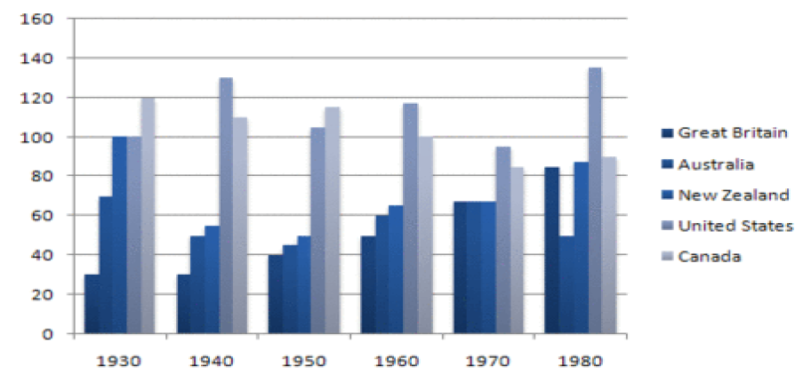
The bar chart below shows how many people were imprisoned in five countries.
Unit: thousand
My essay:
The bar chart gives the number of prison population in five different countries in the period of 50 years.
Overall, the number of prisoners fluctuated in most of the countries over the period shown. Only Great Britain’ prisoners remained consistent trend which where the number increased considerably.
In 1930, the number of prisoners in Canada was the highest, reaching the figure of 120 thousand inmates, compared with nearly 25 thousand and 70 thousand for Great Britain and Australia, respectively. Prisoners in both New Zealand and the United States have the same number (100 thousand). In the following 50 years, despite some fluctuations, Canada’ prisoner decreased to over 80 thousand inmates in 1980. Similarly, the number of prisons in New Zealand and Australia also fell and has the similar number with Great Britain’ prison number at around 60 thousand in 1970.
By contrast, Great Britain witnessed a sharp increase from around 30 thousand in 1940 to over 80 thousand in 1980 in the number of prisoners. In 1980, their number was slightly lower than those in New Zealand where the number of prisoners continued to increase to 85 thousand. Canada’ prison population also went up. Increasing from 1930 to 1950, the number considerably fell to over 80 thousand, before reaching its peak of nearly 140 thousand inmates
Top answer
) in the period of 50 years . (imprecise. g.
- ) in the period of 50 years .
- (imprecise.
- g.
- ) Model opening: The bar chart shows the number of people imprisoned in Great Britain, Australia, New Zealand, the United states and Canada every decade from 1930 to 1980.
- The units are in thousands.
Get the Weekly English Kit 📬
New words, one handy idiom, and a 2-minute quiz — delivered to your inbox to keep your streak alive.
The bar chart gives the number of prison population (wrong usage) in five different countries (which 5?) in the period of 50 years. (imprecise. It could be any 50 years, e.g. from 1835 to 1885!)
Model opening:
The bar chart shows the number of people imp
 Related Questions