
Writing task 1 in IELTS.
Please check and correct mistakes. 
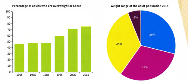
The bar chart shows the percentage of adults who were overweight or obese (too fat or much too fat) in one country from 1965 to 2015. The pie chart shows the proportion of adults who were overweight, obese or severely obese in 2015.
The bar chart decribes changes the proportion of overweight or obese adults over fifty years in a particular country, starting from 1965 to 2015, while the pie charts illustrates the percentage of different weight groups of adults in that country at 2015.
Overalls, in we can see that the proportion of overweight or obese adults changed slightly over the first half of the surveyed period and then increased gradually in the second period of survey, whereas in 2015 obese alduts had the highest proportion of people.
To begin, in 1965, overweight or obese adults accounted for approximately a half and remained stablely in next two years , 1975 and 1985. However , it rose gradually from just under 60% in 1985 to over 70 % in 2015.
The pie chart shows 4 different categories for 34% obese people in 2015, then overweight, healthy or underweight and the last percentage was severely obese. The percentage of people who were dangerously fat has a tiny proportion, about 6%. The remain number of adults who were healthy or underweight and overweight were 29% and 34%, in respectively.
Top answer
Please post essays, paragraphs, dialogues and other writing in the essay forum so a moderator does not have to move your post. Click on this link: Next, tap on the green button "write a new post"
- Please post essays, paragraphs, dialogues and other writing in the essay forum so a moderator does not have to move your post.
- Click on this link: Next, tap on the green button "write a new post"
Get the Weekly English Kit 📬
New words, one handy idiom, and a 2-minute quiz — delivered to your inbox to keep your streak alive.
The bar chart decribes (wrong spelling and wrong word. Describe means to write a paragraph about. Read my advice) changes the (ungrammatical) proportion of overweight or obese adults over fifty years in a particular country, starting from 1965 to 2015, while the
 Related Questions