
Writing task 1 Ielts. Could you help me review my writing, please? Thanks a lot.
WRITE DESCRIPTION HERE
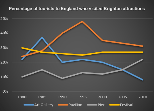
The graph illustrates the percentage of travelers to go insight into 4 Brighton places from 1980 to 2010. Generally, it can be seen that these tendencies had been fluctuating which needs to be analyzed and giving the conclusion.
As we’ve compared, the proportion of people visiting the Art Gallery and Pier seems to have an upward trend from 1980 to 1985. Over the years, there was the difference between the two data, which was the upward trend of the Pier visitors, which increasedto 20%, and so on the downward trend of the Art Gallery, which fell to 9%.
Likewise, there were a lot of changes in two other places, Festival and Pavillion. At the start of the period, the proportion of people joining the Festival was rather than Pavillion. Therefore, after 1985s, the percentage of tourists in Pavilion dramatically peaked at 48% and gradually went down, while the number of people in the Festival was volatile then remained stable.
In conclusion, as we’ve seen, there was an upward trend in Pier data, while these two places, Pavilion and Art Gallery were the downward trends and the Festival graph seemed to stay stable at all times.
Top answer
) Brighton places from 1980 to 2010. Generally, it can be seen that these tendencies had been fluctuating which needs to be analyzed and giving the conclusion. That is a very poor sentence.
- ) Brighton places from 1980 to 2010.
- Generally, it can be seen that these tendencies had been fluctuating which needs to be analyzed and giving the conclusion.
- That is a very poor sentence.
- "Fluctuating" is not a good word.
- Do not write any conclusions or interpretations.
Get the Weekly English Kit 📬
New words, one handy idiom, and a 2-minute quiz — delivered to your inbox to keep your streak alive.
The (What kind of graph?) graph illustrates (not a good word choice) the percentage of travelers (wrong word) to go insight (wrong word) into 4
 Related Questions