
Writing task 1 --- help me please
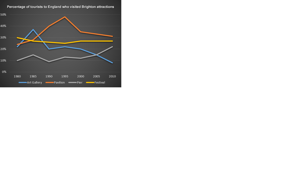
The line graph illustrates the proportion of tourists to England who visited four destinations at Brighton in over the period 30 years starting in 1980.
A glance at the graph, it is clear that the number of people visited Pavilion and Pier escalated into the period. By contrast, there was a downward trend in proportion of tourists visited Art Gallery and Festival in the same time.
At the beginning, the number of people visited Pavilion developed significantly from 23% in 1980 and reached the peak at nearly 50% in 1995 but that declined considerably to 30% in 2010. Into the period, beginning with 10% in 1980, the proportion of visitor visited Pier experienced an upward trend and peaked the highest point at 22% in 2010.
On the other hand, the quantity of tourists visited Art Gallery surged from over 20% in 1980 to nearly 40% in 1985. However, there was a dramatic decline trend in number of people visited Art Gallery in next 25 years and dropped at nearly 10% in 2010. Meanwhile, the amount of visitors visited Festival diminished slightly from 30% in 1980 to 28% on 2010.
Get the Weekly English Kit 📬
New words, one handy idiom, and a 2-minute quiz — delivered to your inbox to keep your streak alive.
 Related Questions