
WRITING TASK 1 HELP
The graph shows the percentage of male and female academic staff members across the faculties of a major university in 2012.
Summarise the information by selecting and reporting the main features, and make comparisons where relevant.
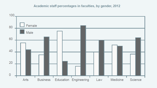
The chart compared the proportion of male and female teachers who taught in seven different faculties of a particular university in 2012.
In brief, male-dominated faculties were business, engineering, law, and science. Women, on the other hand, led in arts and education, while made up half the percentage of medicine.
There was a gender contrast among some faculties. Most male academic staff participated in the engineering faculty, which was over 80% and was nearly six times as many as females. Similarly, the percentage of men nearly doubled women staff members in business and law. In contrast, in the case of education, three-quarters of the teachers were women, with just under 30% were male. Likewise, women dominated the faculty of arts, more than half of the academics were female.
Furthermore, there were some similarities between other faculties. Concerning medicine, the percentage of women was equivalent to men. Notably, both business and science departments had the same proportions for both genders, with roughly 40% female and 60% male academics in those faculties.
Top answer
) compared (Use present tense for the chart. Use past tense for the information in the chart. ) the proportion of male and female teachers who taught in seven different faculties of a particular university in 2012.
- ) compared (Use present tense for the chart.
- Use past tense for the information in the chart.
- ) the proportion of male and female teachers who taught in seven different faculties of a particular university in 2012.
- In brief, the male-dominated faculties were business, engineering, law, and science.
- Women, on the other hand, led in arts and education, while there were equal numbers in made up half the percentage of medicine.
Get the Weekly English Kit 📬
New words, one handy idiom, and a 2-minute quiz — delivered to your inbox to keep your streak alive.
The chart (What kind of chart is it?) compared (Use present tense for the chart. Use past tense for the information in the chart. . ) the proportion of male and female teachers who taught in seven different faculties of a particular university in 2012.
In brief,
 Related Questions