
WRITING TASK 1 (CAM 10 - TEST 1)
The first chart below shows how energy is used in an average Australian household. The second chart shows the greenhouse gas emissions which result from this energy use.
Summarise the information by selecting and reporting the main features, and make comparisons where relevant.
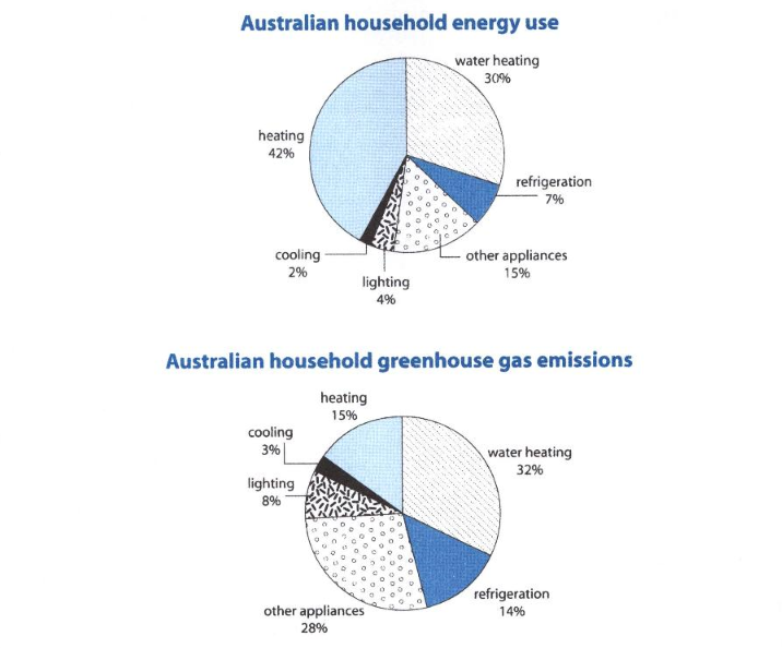
The two pie charts show the average amount of energy used in each Australian family and the greenhouse gas emissions which stem from this energy use.
Overall, it can be clearly seen from the first graph the Australian people tend to use energy for heating and water heating much more than the others, while water heating is also the most eco-unfriendly energy use in the chart.
An average Australian household uses just only 2% and 4% of energy for cooling and lighting respectively. Heating and water heating, in contrast, are mostly used with 42% and 30%. Additionally, an insignificant amount of energy is consumed for refrigeration and other appliances.
As they are least used, cooling and lighting become the most environmentally friendly needs with just 3% and 8%. Although heating is mostly done, its damage to the environment is not as serious as that of water heating (32%). This figure is followed by 28% of other appliances.
(157 words)
Top answer
Please post essays, paragraphs, dialogues and other writing in the essay forum so a moderator does not have to move your post. Click on this link: Next, tap on the green button "write a new post" ------------------- Please read my advice for Task 1 essays: IELTS TASK 1: Hints, Tips And Advice Vocabulary Words For Task 1: Reference Post
- Please post essays, paragraphs, dialogues and other writing in the essay forum so a moderator does not have to move your post.
- Click on this link: Next, tap on the green button "write a new post" ------------------- Please read my advice for Task 1 essays: IELTS TASK 1: Hints, Tips And Advice Vocabulary Words For Task 1: Reference Post
Get the Weekly English Kit 📬
New words, one handy idiom, and a 2-minute quiz — delivered to your inbox to keep your streak alive.
The two pie charts show the average amount of energy used in each by Australian families and the greenhouse gas emissions which stem from this energy use. (You completely ignored the breakdown by different sources, so your description is inadequate. You must tell the reader how may sectors are o
Sample essay.
In this essay, I compare the proportionate amounts of energy use with the greenhouse gas emissions.
The two pie charts compare the energy consumption and greenhouse gas emissions of six different types of appliances in a typical Australian household. These types are heating, water heating, cooling, lighting, refrigeration and “other appliances
The first chart below illustrates the percentage of australian household energy use while the second charts display the green gas emissions which results from the energy use in australia.
Overall, Heating and water account for a significant proportion of energy use while most green gas emissions result from water, heating and other appliances.
Heating and water are the two largest
The first pie chart illustrate the average Australian household energy consumption and the second pie chart shows that average household greenhouse gas emissions.
Overall it is clear that majority percent of people in Australia used large proportion of their energy on just three categories. Moreover greenhouse gas also emitted from those large three categories.
In Austral
The first pie chart shows the percentages of contributed to the energy usage of an Australian household and the second pie chart shows the greenhouse gas emissions from an Australian household.
Overall, while heating and water heating account for a significant portion of energy usage but most greenhouse gas emission results from water heating and other appliances.
Here, heating and
The pie charts illustrate the utilization of energy in an average Australian household and its consequences resulting in the production of greenhouse gases.
Overall, most of the energy is being used for heating and water heating ,while cooling has the most eco-friendly energy usage.
To elucidate, most people in Australia utilize energy for heating and water heating with a proportio
 Related Questions