
Writing task 1 - bar chart
please help me if you have time. i really need your comments !
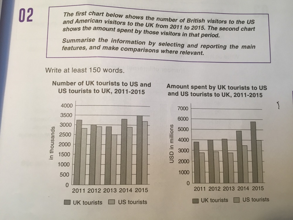
The given charts illustrate the number of the UK tourists visit America and the US visitors to the UK in the first graph and their spending patterns in the second graph from 2011 to 2015.
Overall, British visitors to the US were more than US visitors and the spending of them was higher as well.
Base on the first chart’s data, it is clear that the number of UK tourists was more than America toursits and had some slight shifts around 3000 to 3500 but it still remained oustripping the US. After witnessed a sharp fluctuation and hit the lowest point at 2500 visitors in 2013, it then ascended considerably to about 3200 visitors in 2015.
In the second graph, British tourist spent more amount of money than American did. While the US visitors spending patterns was relatively flat at approximately 3000 million dollars between 2011 and 2013 then had a gradual increase after 2013, the UK visitors shoot up continually and peaked at 6000 million dollars in 2015.
Top answer
Please post essays, paragraphs, dialogues and other writing in the essay forum so a moderator does not have to move your post. htm
- Please post essays, paragraphs, dialogues and other writing in the essay forum so a moderator does not have to move your post.
- htm
Get the Weekly English Kit 📬
New words, one handy idiom, and a 2-minute quiz — delivered to your inbox to keep your streak alive.
Please post essays, paragraphs, dialogues and other writing in the essay forum so a moderator does not have to move your post.
https://www.englishforums.com/English/EssayReportCompositionWriting/Forum9.htm
 Related Questions