
Writing task 1 - Bar chart
The table below shows the figures for imprisonment in five countries between 1930 and 1980. (The y axis shows numbers of prisoners in thousands).
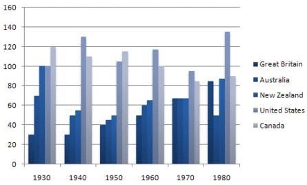
The bar chart illustrates the number of people in prison in five different countries from 1930 to 1980.
Overall, the proportion of prisoners in 5 countries fluctuated. The figures for the US and Canada were highest.
There was a dramatic increase in the number of prisoners in the US. It was from 100 thousands in 1930 and then reached a peak of nearly 140 thousands. The figure for United States was highest almost all time surveyed. The rate of imprisonment in Canada decreased sharply . This proportion exactly 120 thousands fell to about 90 thousands between 1930 and 1980, a decrease of about 30 thousands in 50 years.
Great Britain saw a significant rise in the number of people in prison. In 1930, which accounted for the smallest part about 30 thousands before reaching the highest point at over 80 thousands in 1980. The figures for the prison population in Australia and New Zealand fluctuated between over 40 thousands and 100 thousands. In 1970, the number of prisoners in Great Britain, Australia and New Zealand were the same, at around 65 thousands.
Top answer
) from 1930 to 1980. Overall, the proportion (wrong word. "Proportion is a value that is always less than or equal to one.
- ) from 1930 to 1980.
- Overall, the proportion (wrong word.
- "Proportion is a value that is always less than or equal to one.
- ) of prisoners in 5 countries fluctuated .
- (wrong word.
Get the Weekly English Kit 📬
New words, one handy idiom, and a 2-minute quiz — delivered to your inbox to keep your streak alive.
The bar chart illustrates shows the number of people in prison in five different countries (which countries?) from 1930 to 1980.
Overall, the proportion (wrong word. "Proportion is a value that is always less than or equal to one. Are the numbers on the chart less than 1?) of prisoners in 5 countries
 Related Questions