
Writing task 1: Australian household energy use and Australian household greenhouse gas emissions
The first chart below shows how energy is used in an average Australian household. The second chart shows the greenhouse gas emissions which result from this energy use.
Summarise the information by selecting and reporting the main features, and make comparisons when relevant.
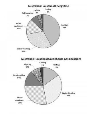
The pie charts illustrate the percentage of energy consumed in an average household and that of exhaust emissions released from the energy consumption in Australia respectively in the first and another / the other picture.
Looking at the graph, it is immediately obvious that heating purpose registers the lowest energy consumption in Australia. Similarly, the smallest toxic exhaust fumes are recorded for cooling.
In Australian households, the heating part constitutes the majority of energy consumption at 42 percent while greenhouse gas emissions from heating only make up at 15 percent. A similar opposite pattern can be seen in refrigeration, lighting and other appliances purpose and exhaust emissions created from these activities which account for 7, 4,15 percent and 14, 8, 28 percent respectively.
Such significant discrepancies across energy using and toxic exhaust fumes resulting from the rest of the activities are not seen. In particular, the amount of energy used for water heating and cooling constitutes 30 and 2 percent which rather identical to the figures for the greenhouse gas emissions from these purposes at 32 and 3 percent respectively.
Top answer
Please post essays, paragraphs, dialogues and other writing in the essay forum so a moderator does not have to move your post. htm Please read my advice for Task 1 essays: IELTS TASK 1: Hints, Tips And Advice Vocabulary Words For Task 1: Reference Post
- Please post essays, paragraphs, dialogues and other writing in the essay forum so a moderator does not have to move your post.
- htm Please read my advice for Task 1 essays: IELTS TASK 1: Hints, Tips And Advice Vocabulary Words For Task 1: Reference Post
Get the Weekly English Kit 📬
New words, one handy idiom, and a 2-minute quiz — delivered to your inbox to keep your streak alive.
Please post essays, paragraphs, dialogues and other writing in the essay forum so a moderator does not have to move your post.
https://www.englishforums.com/English/EssayReportCompositionWriting/Forum9.htm
Please read my advice for Task 1 essays
You have some good points, but the English is not very good, especially the vocabulary.
The pie charts ( How many?) illustrate (Wrong word. We do not illustrate percentages.) the percentage of energy consumed in an average household and that of exhaust emissions (You have
Sample essay:
The two pie charts compare the energy consumption and greenhouse gas emissions of six different types of appliances in a typical Australian household. These types are heating, water heating, cooling, lighting, refrigeration and “other appliances”.
Overall, two types, heating and water heating, consume nearly three-quarters of the total energy, an
 Related Questions