
Writing task 1
The line graph compares how much did electricity manufacture from different power sources to provide for the city of New York from 1980 to 2000. Overall, the figures for petroleum and natural gas increased over this period. In contrast, the amount of petroleum was quite higher than the other two materials throughout the whole time frame.
In 1980, coal crafted 220 kWh and had an upward tendency. Yet it remained steady at nearly 180 kWh during 1995. By the end of this period, the figures then remained unchanged at 180 kWh then had declined overall.
There was 100 kWh nature gas to create electricity compared with 350 kWh petroleum in 1980. In the first 5 years, natural gas stay uniform at 100 kWh and started to increase gradually. Besides, petroleum registered a rapid fall back at this period too. By the year 2000, the amount of petroleum and natural gas remained higher than coal with 720 kWh 500 kWh, and 180 kWh respectively.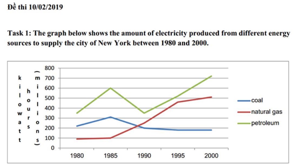
Top answer
The line graph compares how much did electricity [ 1 ] was generated manufacture from three different power energy sources (coal, natural gas, and petroleum) to provide power for the city of New York from 1980 to 2000. [ 2 ] Overall, the figures for petroleum and natural gas increased over this period. [ 3 ] In addition, contrast, the amount of graph for petroleum was quite higher than the other two materials throughout the entire period.
- The line graph compares how much did electricity [ 1 ] was generated manufacture from three different power energy sources (coal, natural gas, and petroleum) to provide power for the city of New York from 1980 to 2000.
- [ 2 ] Overall, the figures for petroleum and natural gas increased over this period.
- [ 3 ] In addition, contrast, the amount of graph for petroleum was quite higher than the other two materials throughout the entire period.
- the whole time frame.
- In 1980, coal [ 4 ] crafted generated 220 kWh , and its graph rose for the following five years, but dropped back to around 200 kWh over the next five and gradually fell to had an upward tendency.
Get the Weekly English Kit 📬
New words, one handy idiom, and a 2-minute quiz — delivered to your inbox to keep your streak alive.
The line graph compares how much did electricity [ 1] was generated manufacture from three different power energy sources (coal, natural gas, and petroleum) to provide
 Related Questions