
Writing task 1
point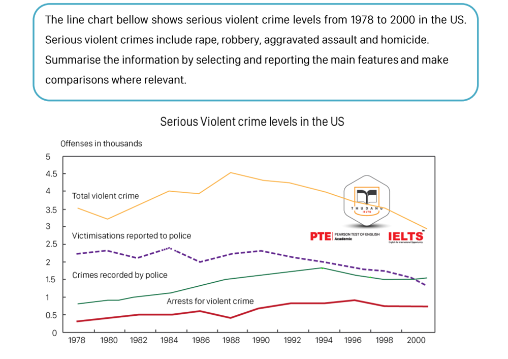
The given line graph dedicates the rate of offense in America in the final two decades of the twentieth century in terms of four particular catalogs.
Overall, either total violent crimes or victimizations reported to police experienced a downward trend. In contrast, both crimes recorded by police and arrests for violent crime witnessed a slight rise.
Turning into details, in the first ten years, there were fluctuations in the total crime level, but the overall trend was upbeat. The lowest and highest points were recorded at about 3.2 and 4.5 respectively in this period. The number of arrested offenses leveled off below 0.5 people per 1000 in 1989 after having a moderate increase for 11 years. From 1990 to 1997, the arrest rate recovered with a slow speed then it continued to slightly decrease by 0.3 offences per thousand. The level of crimes recorded by police significantly went up and rose to a record high, around 2 offenses per thousand Americans in the year 1995. The number of victimizations reported to police reached the lowest at 2 offenses per thousands in 1987 as soon as hit the highest point in 1985. From 1990 onwards, this number tent to plummet.
Top answer
It is very very important to study the graph and determine the units of measurement. It is written at the top of the Y-axis. I have highlighted the text here: Y-axis units "in thousands" means that the numbers on the graph need to be multiplied by 1000.
- It is very very important to study the graph and determine the units of measurement.
- It is written at the top of the Y-axis.
- I have highlighted the text here: Y-axis units "in thousands" means that the numbers on the graph need to be multiplied by 1000.
- Offenses are measured.
- For example the Total Violent Crime peaked at 4,500 offenses in 1989 and it steadily decreased to jut under 3,000 in 2000.
Get the Weekly English Kit 📬
New words, one handy idiom, and a 2-minute quiz — delivered to your inbox to keep your streak alive.
 Related Questions