
WRITING TASK 1
You should spend about 20 minutes on this task.
The bar chart below shows the total number of minutes (in billions) of telephone calls in Australia, divided into three categories, from 2001- 2008. Summarise the information by selecting and reporting the main features and make comparisons where relevant.
You should write at least 150 words.
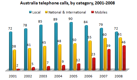
The column graph illustrates the number of minutes spent on three different categories of phone calls in Australia for 8 years. Overall, there was an increase in the figures for local from 2001-2005 before declining in the following three years, while that for national/international and mobiles mirrored each other with an upward trend. Local phone calls accounted for the highest usage throughout the period, followed by national/international, and the figure for mobiles was the least popular.
As can be seen from the graph, from 2001 to 2008, the amount of time spent on the local line was far more than that of the other two. In 2001, the Australian spent a total of 72 billion minutes on the local lines, then the figure reached a peak of 90 billion 5 years later. By 2008, subsequently, it had dropped to the same point that it began with.
In contrast, the number of minutes of both national/ international and mobile phone calls increased between 2001 and 2008. However, throughout the 8 years, while there was a slight growth in the figure for national/international, approximately 23 billion minutes, the amount of time spent on mobile lines had witnessed a tremendous rise by 2008, starting at 2 billion minutes then rocketed to end at 46 billion.
Top answer
Well, I might have made different organizational choices, but this is a fairly complete and well-written composition. Here are my suggestions for improving it: The column graph illustrates the number of minutes spent on three different categories of phone calls in Australia for over a period of 8 years. } Overall, there was an increase in the figures for local calls from 2001-2005 before declining in the following three years, while that for national/international and mobile calls mirrored each other with an upward trend.
- Well, I might have made different organizational choices, but this is a fairly complete and well-written composition.
- Here are my suggestions for improving it: The column graph illustrates the number of minutes spent on three different categories of phone calls in Australia for over a period of 8 years.
- } Overall, there was an increase in the figures for local calls from 2001-2005 before declining in the following three years, while that for national/international and mobile calls mirrored each other with an upward trend.
- Local phone calls accounted for the highest usage throughout the period, followed by national/international, and finally the figure for mobiles was the least popular .
- As can be seen from the graph, F rom 2001 to 2008, the amount of time spent on the local line was far more than either that of the other two.
Get the Weekly English Kit 📬
New words, one handy idiom, and a 2-minute quiz — delivered to your inbox to keep your streak alive.
Well, I might have made different organizational choices, but this is a fairly complete and well-written composition. Here are my suggestions for improving it:
The column graph illustrates the number of minutes spent on three different categories of phone calls in Australia for over a period of 8 years. {I would separate this gene
 Related Questions