
Writing task 1
The pie charts illustrate the amount of electricity consumption according to different segments in the East of Australia from 2007 to 2010. Units are measured in percent.
Overall, what stands out from the charts is that the trend of the two pie charts was quite similar between 2007 and 2010. Another intriguing characteristic is that electricity usage in manufacturing and aluminium increased slightly, while all the rest of the sectors remained stable.
Looking in more details, using electricity in residential areas was the most popular, representing nearly 28% in both 2007 and 2010. With the same tendency, commercial electricity usage also remained unchanged at 23% in the period shown. By contrast, transport and agriculture’s electricity consumption only accounted for a tiny fraction in 2007, roughly 1% and 0.8% respectively. However, it didn’t fluctuate 3 years later.
With respect to electricity consumption in manufacturing, in 2007, it represented about 13% and fell by 4% in the next 3 years. Similarly, using electricity in aluminium process also made up 13% of all. Nevertheless, its dropped modestly to 11% in 2010.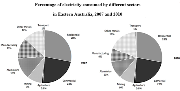
Top answer
" Why should I spend any more time on a thankless task?
- " Why should I spend any more time on a thankless task?
Get the Weekly English Kit 📬
New words, one handy idiom, and a 2-minute quiz — delivered to your inbox to keep your streak alive.
I have given you lots of feedback on many essays, but you hardly ever acknowledge it or even say "thank you." 
The pie charts illustrate the amount of electricity consumption according to different segments in the East of Australia from 2007 to 2010.
 Related Questions