
Writing task 1
WRITE DESCRIPTION HERE
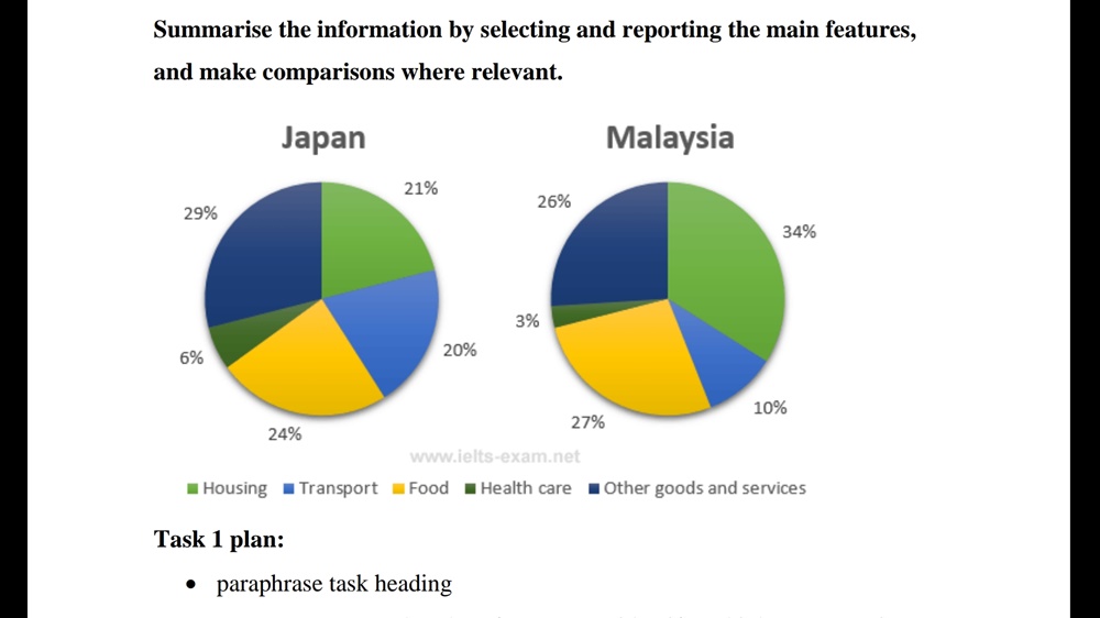
The pie charts compare two countries( Malaysia and Japan) in terms of the average amount of money spent of 5 different categories, namely housing, transport, food, healthcare and goods/other services in 2010
Overall, Malaysian and Japanese spent most of their income on housing, food and other goods/services and the least on healthcare and transport.
At 34%, the expenditure on housing was the highest in Malaysia. The figure was still high in Japan, at 21%. Other goods/services category accounted for the largest proportion(29%) in Japan, 2% higher than Malaysia. Regarding expenditures on food, Malaysia and Japan were similar, at 27% and 24% respectively.
Japanese allocated 20% of the income for transport and 6% for healthcare, exactly doubled those for Malaysian.
Top answer
The pie charts compare two countrie s( Malaysia and Japan) in terms of the average amount proportions / percentages (Be careful. Amounts of money would be monetary values like $1450 or $230. ) of money spent of (wrong word) 5 (spell out small numbers if they are not data values.
- The pie charts compare two countrie s( Malaysia and Japan) in terms of the average amount proportions / percentages (Be careful.
- Amounts of money would be monetary values like $1450 or $230.
- ) of money spent of (wrong word) 5 (spell out small numbers if they are not data values.
- ") different categories, namely housing, transport, food, healthcare and goods/other services in 2010 (missing punctuation) Overall, Malaysians and Japanese spent most of their income (Be careful about making assumptions that are not given in the diagram or instructions.
- The chart does not contain all spending , only these five categories.
Get the Weekly English Kit 📬
New words, one handy idiom, and a 2-minute quiz — delivered to your inbox to keep your streak alive.
The pie charts compare two countries( Malaysia and Japan) in terms of the average amount proportions / percentages (Be careful. Amounts of money would be monetary values like $1450 or $230. The pie charts do not show amounts of money.) of money
 Related Questions