
Writing Task 1
The given line chart shows the number of elderly people spent in free-time from 1980 to 2010, measures tons of percent, in Europe.
Overall, it is difference that the figure for elderly people more spending hiking than other types of sports.
It can be seen that, In 1980, Hiking were spent by 20% elderly people,compared with Surfing the Internet only 0% elderly people, and it the following year, there were 10% elderly people by Surfing the Internet and 40% were spent by Hiking. In the next two years, the largest increase in readership has been for Hiking, at 80% and around 50% elderly people spent in Surfing the Internet. In addition to that, the number of elderly people spent in playing sport that having dropped slightly in 2010, at just under 70%, compared with in 2000, attracting 70%. After increasing dramatically from 1980 to 1990, the reader slight dropped, and then rising dramatically in 2010 and starting at 50% elderly people in 1980, the rate of elderly people decreased significantly in 1990, and then dramatical decreasing to reach a peak of around 45% in the next two years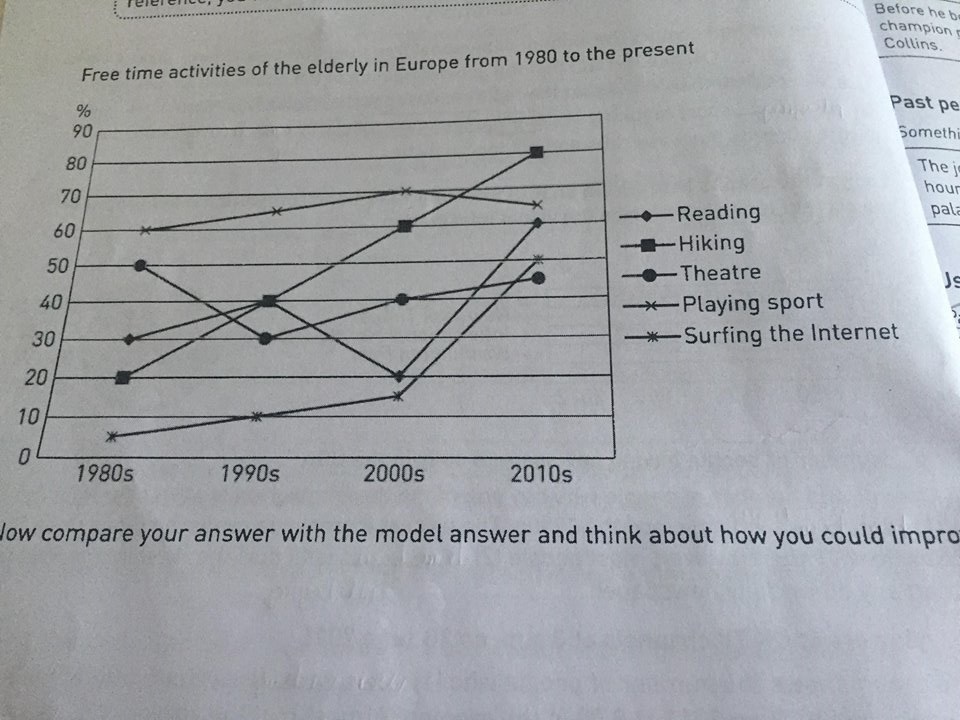
Top answer
I could not understand most of your writing. Here is a starting paragraph for an essay about this figure. The line graph shows the percentage of elderly people in Europe who participated in five different leisure time activities between 1980 and 2010.
- I could not understand most of your writing.
- Here is a starting paragraph for an essay about this figure.
- The line graph shows the percentage of elderly people in Europe who participated in five different leisure time activities between 1980 and 2010.
- The activities are: Reading, Hiking, Going to the Theater, Playing Sport, and Surfing the Internet.
- The given line chart (wrong word.
Get the Weekly English Kit 📬
New words, one handy idiom, and a 2-minute quiz — delivered to your inbox to keep your streak alive.
I could not understand most of your writing. Here is a starting paragraph for an essay about this figure.
The line graph shows the percentage of elderly people in Europe who participated in five different leisure time activities between 1980 and 2010. The activities are: Reading, Hiking, Going to the Theater, Playing Sport, and Surfing the Internet.
The given
 Related Questions