
Writing task 1
Essay topics: The charts below give information on the ages of the populations of Yemen and Italy in 2000 and projections for 2050.
Summarise the information by selecting and reporting the main features, and make comparisons where relevant.
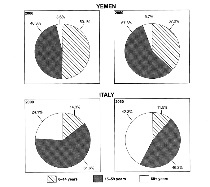
The pie chart illustrate the proportion of different ages contributed to the populations of Yeman and Italy in 2000 and 2050.
Overall, both Yemen and Italy have a significant change in the percentage of populations from 2000 to 2050. People below 15 year olds in Yemen made up the largest part of the pie but it is predicted to be replaced with working-age people. In Italy, people between 15 and 59 and the youngsters remain the most and the least contribution to the population through 50 years.
In 2000, the proportion of people from 0 to 14 in Yeman was over half of the pie chart (50.1%) wheares those in Italy took up 14.3%. There was a contrast in the number of people retirement age in Yemen and Italy that the percentage of them in Italy was over seventimes as many as those in Yeman which was at the rate of 3.6%.
In the year 2050, the number of people at working age is predicted to make up the most contribution to the population in both Yemen and Italy with the figure 57.3% and 46.2% respectively. In Yeman, the smallest segment of the pie is projected to be people over 60 at the rate of 5.7% while in Italy, the contribution of people below 15 year olds is likely to account for 11.5%, which is the least significant part of the population.
(232 words)
Get the Weekly English Kit 📬
New words, one handy idiom, and a 2-minute quiz — delivered to your inbox to keep your streak alive.
 Related Questions