
Writing Task 1
Can you please check my work and, if possible, give it a band score. Thank you in advance
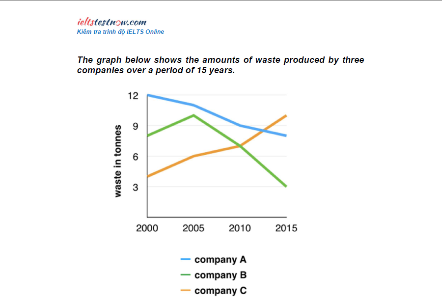
The line graph makes a comparison of three companies with regard to their waste production from 2000 to 2015.
As an overall trend, all three figures changed rapidly over the course of 15 years. While the amounts of waste produced by company A and B observed a fall after the 15-year period, the figure increased sharply for company C.
From 2000 to 2005, the waste output of company A declined from 12 tonnes to roughly 11 tonnes. Meanwhile, in 2000, the amounts of waste produced by company B and C were about 8 tonnes and 4 tonnes, these numbers rose slightly to around 10 tonnes and 6 tonnes in 2005
Then, within 10 years from 2005 to 2015, company A reduced its waste production by about 3 tonnes, reaching 8 tonnes in 2015. Similarly, the figure for company B saw a significant decrease of 7 tonnes, dropping to only 3 tonnes in 2015. In contrast, the waste output of company C went up to 10 tonnes during the same period.
Top answer
Can you please check my work and, if possible, give it a band scor e? [ 1] Thank you in advanc e. [ 1] The line graph makes a comparison of three companies with regard to their waste production from 2000 to 2015.
- Can you please check my work and, if possible, give it a band scor e?
- [ 1] Thank you in advanc e.
- [ 1] The line graph makes a comparison of three companies with regard to their waste production from 2000 to 2015.
- As an O veral l, [ 2] trend, all three figures changed rapidly over the course of 15 years.
- w hile the amounts of waste produced by company A and B fell observed a fall after over the 15-year period, the figure amount increased sharply for company C.
Get the Weekly English Kit 📬
New words, one handy idiom, and a 2-minute quiz — delivered to your inbox to keep your streak alive.
Can you please check my work and, if possible, give it a band score? [ 1] Thank you in advance. [ 1]
The line graph makes a comparison of three companies with regard to their waste production from 2000 to 2015.
As an Overa
 Related Questions