
Writing Part 1 IELTS - Line graph, US Energy Consumption
First and foremost, thanks for all your kindness and support. My writing needs constant improvements, and I so appreciate I get your help along the way.
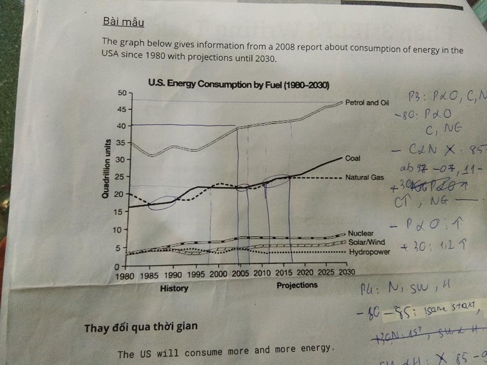
The line graph shows the amount of energy by fuel consumed in the US from 1980 to 2030. The six curves were plotted to represent Petrol and Oil, Coal, Natural Gas, Nuclear, Solar/Wind, and Hydropower. Overall, there is an upward trend in the use of renewable energy over time. However, the consumption of nonrenewable energy will continue to take up a larger portion until 2030.
In 1980, the consumption of Petrol and Oil was 35 quadrillion units, around 1.5 to 2 times higher than those of Coal and Natural Gas. The figures for Coal and Natural Gas were equal several times throughout the period: from 1985 to 1990, 1997 to 2007, and 2011 to 2017. However, between 2017 and 2030, the amounts of energy from those reflected different trends, coal's consumption will rise while natural gas's will level off. On the other hand, Petrol and Oil have increased stably during the period and will reach nearly 48 quadrillion units in 2030, 1.2 higher than their starting point.
Between 1980 and 1985, Nuclear, Solar/Wind, and Hydropower shared the same starting amounts until Nuclear started increasing more noticeably in 1990. From that point, the consumption of Nuclear has outstood the other two and in 2030, Nuclear will become the most used renewable energy. After being equal from 1985 to 1990, there has been an upward trend in the amount of Solar/Wind consumed contrasted to the decrease of Hydropower. In 2030, Hydropower will be the least common renewable energy in the US.
Get the Weekly English Kit 📬
New words, one handy idiom, and a 2-minute quiz — delivered to your inbox to keep your streak alive.
 Related Questions