
Writing Part 1 IELTS - Line graph, Unemployment Rates
I appreciate that you spend your time helping with my writing. Your advice is precious and really helpful for me.
Thanks in advance.
Have a nice day!
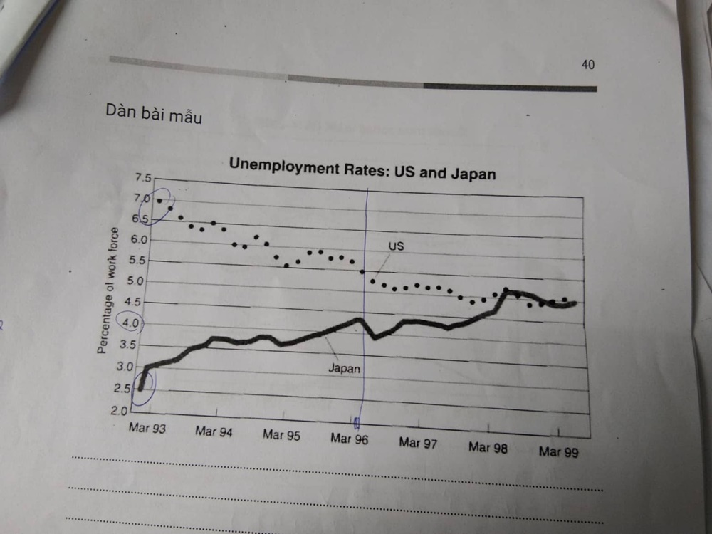
The line graph shows the percentage of jobless people in the US and Japan from March 1993 to March 1999.
Overall, despite their different starting points, by the end of the period, these two countries shared the approximately same unemployment rate. However, while there was a downward trend in the US throughout the period, the number of unemployed people in Japan's workforce had an upward tendency.
In March 1993, there were 7 in 100 American people being out of work compared to just 2.5 people of Japan. Three years from there, the percentage of people having no jobs in Japan's workforce increased almost twofold, while the US's decreased by about 21%.
Between 1996 and 1999, the US showed subtle changes in its unemployment rate. On the other hand, Japan reached its peak in the first half of 1998 and continued to increase rapidly until 1999. At this point, the figure went up by 200% since March 1993 and stood at around 5%, equaled to the US's.
Top answer
The line graph shows the unemployment rates percentage of jobless people (wrong expression) in the US and Japan from March 1993 to March 1999. The title of the graph gives the statistic that is shown: the unemployment rate. These economic statistics have precise definitions and you should not use synonyms or other phrases because they do not have a definition.
- The line graph shows the unemployment rates percentage of jobless people (wrong expression) in the US and Japan from March 1993 to March 1999.
- The title of the graph gives the statistic that is shown: the unemployment rate.
- These economic statistics have precise definitions and you should not use synonyms or other phrases because they do not have a definition.
- Overall, despite their different starting points, by the end of the period, these two countries had shared the approximately the same unemployment rate.
- However, while there was a downward trend in the US throughout the period, the number of unemployed people in Japan's rate workforce had an upward trend tendency .
Get the Weekly English Kit 📬
New words, one handy idiom, and a 2-minute quiz — delivered to your inbox to keep your streak alive.
The line graph shows the unemployment rates percentage of jobless people (wrong expression) in the US and Japan from March 1993 to March 1999.
The title of the graph gives the statistic that is shown: the unemployment rate. These economic statistics have precise definitions and you should not use synonyms or other phras
 Related Questions