
Writing IELTS task 1. Please help me. Thank you so much.
Topic: The graph shows the percentage of male and female academic staff members across the falcuties of a major university in 2012.
[TEXT]
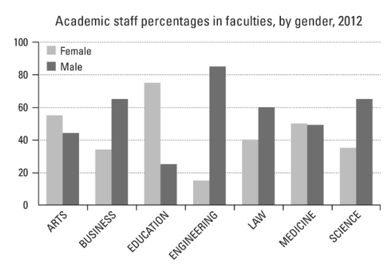
The bar chart illustrates the proportion of academic members of staff by gender throughout the falcuties of a particular university in 2012.
It is clear that the percentage of man staff members was higher than its woman members in most falcuty. In addition, engineering was the area which contain male staff most while the opposite was true for education.
According to the chart, the percentage of male staff in business, engineering, law and science faculties was higher than the proportion of female while the opposite was true in other faculties. Particularly, most figures for male staff was above 60% compared to slightly under 40% of the other gender. In contrast, the proportion for man staff members were lower than its of woman staff members respectively.
Looking at the highest column on the chart, more 80% staff members in engineering faculty were male in comparison with just under 20% of the percentage of female. On the other hand, with nearly 80%, the proportion of woman staff was approximately 3 times as much as the percentage of man staff in education faculty. Generally, the figures for man staff in engineering and woman staff in education were considerable higher than the other faculties.
Top answer
Topic: The graph shows the percentage of male and female academic staff members across the falcuties of a major university in 2012. [TEXT] The bar chart illustrates (Not a good word to use) the proportion of academic members of staff by gender throughout (Not a good word to use) the falcuties of a particular university in 2012. (The bar chart shows the relative proportions of men and women staff members in seven different faculties at a major university in 2012.
- Topic: The graph shows the percentage of male and female academic staff members across the falcuties of a major university in 2012.
- [TEXT] The bar chart illustrates (Not a good word to use) the proportion of academic members of staff by gender throughout (Not a good word to use) the falcuties of a particular university in 2012.
- (The bar chart shows the relative proportions of men and women staff members in seven different faculties at a major university in 2012.
- ) It is clear that (Those words are unnecessary.
- Describe the data.
Get the Weekly English Kit 📬
New words, one handy idiom, and a 2-minute quiz — delivered to your inbox to keep your streak alive.
Topic: The graph shows the percentage of male and female academic staff members across the falcuties of a major university in 2012.
[TEXT]
The bar chart illustrates (Not a good word to use) the proportion of academic members of staff by gender
 Related Questions