
Writing IELTS Task 1
Could you look through my writing and give me some comments? Thank you for your time!
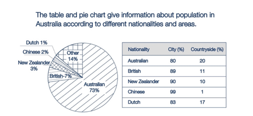
The provided pie chart compares the percentages of people residing in Australia based on their country of origin whilst the table illustrates the distribution of these people in urban and rural areas.
Generally speaking, it can be seen from the first chart that the vast majority of the Australian population are native to the nation. It is also noteworthy that most of the Australian population choose to live in cities, irrespective of their nationalities.
Concerning the pie chart, the Australian make up the largest proportion of the total population, with data recorded just under three-quarters, followed by 7% of those who come from Britain. New Zealanders, the Chinese, and the Dutch account for an aggregated figure of 6% of the overall Australian population, compared to the remaining 14% of people coming from other countries.
With regard to the table, nearly all of the Chinese opt to live in cities as opposed to a tiny 1% of those residing in the countryside. Similarly but less strikingly, there is an 80% gap between New Zealanders living in urban areas and rural areas of Australia. A similar pattern is observed for the British, the Australian and the Dutch as city population contributing between 80% and 89%.
Get the Weekly English Kit 📬
New words, one handy idiom, and a 2-minute quiz — delivered to your inbox to keep your streak alive.
 Related Questions