
Writing IELTS task 1
This is my essay for task 1 in the IELTS exam. Please check for some mistakes. Thanks!
My essay:
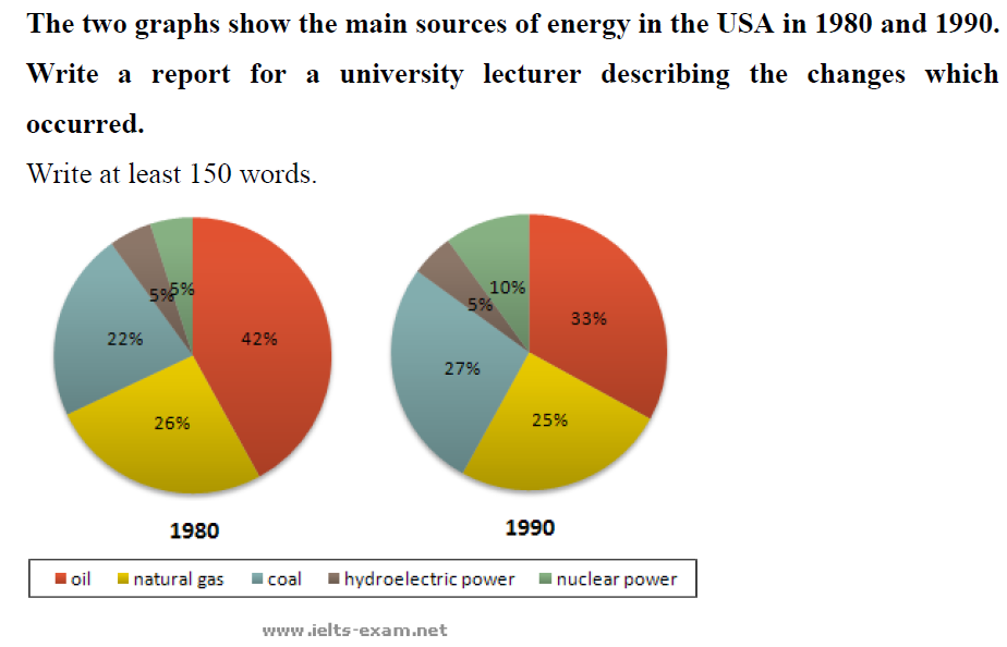
The two pie charts compare the percentage of the main energy sources for four different fuels in the USA from 1980 to 1990.
Overall, oil was the main energy source in the USA throughout the period. While most of the source of energy increased, except for natural gas, hydroelectric power still remained.
In 1980, the percentage of energy source for oil was the highest (42%). This then decreased sharply to 33% in 1990. There was a slight rise in the proportion of energy source for natural gas by 1%, from 26% in 1980 to 25% in 1990. Hydroelectric power was a sole energy source remaining the percentage of 5% from 1980 to 1990.
By contrast, there is a considerable increase in the proportion of energy sources for coal and nuclear power. The percentage of energy source for coal went up from 22% in 1980 to 27% in 1990. Only 5%, the percentage for nuclear power rose by 5% from 1980, then this reached the percentage of 10% in 1990.
Top answer
The two pie charts compare the percentag es of the main energy sources for as represented by four different fuels in the USA from in the years 1980 to and 1990. [ 1] Overall, oil was the main energy source in the USA in both years, although its use decreased over the ten-year period. [ 1] throughout the period.
- The two pie charts compare the percentag es of the main energy sources for as represented by four different fuels in the USA from in the years 1980 to and 1990.
- [ 1] Overall, oil was the main energy source in the USA in both years, although its use decreased over the ten-year period.
- [ 1] throughout the period.
- Moreover, w hile most of the source of energy the figures representing coal and nuclear energy increased, except those for natural gas, and hydroelectric power saw little change.
- still remained.
Get the Weekly English Kit 📬
New words, one handy idiom, and a 2-minute quiz — delivered to your inbox to keep your streak alive.
The two pie charts compare the percentages of the main energy sources for as represented by four different fuels in the USA from in the years1980 to and 1990. [ 1]
Overal
phamnganThe two pie charts compare the percentage of the main energy sources for four different fuels
There are five sources of energy.
phamnganThere was a slight rise in the proportion of energy source for na
 Related Questions