
Writing IELTS task 1
Hi, I am preparing for the IELTS exam. Please check for my mistakes. Thanks!
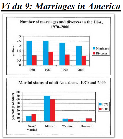
The first bar chart gives information of how many people who got married and devours in the period from 1970 to 200 and the second bar chart gives the percentage of marital status of grown-up people in America in two years 1970 and 2000
Overall, it is clear that the number of marriages is much higher than those who divorced in a period of 30 years. Between 1970 and 2000, the percentage of married people was the highest.
For the first chart, there was a similar figure for the number of marriages at 2.5 million in 1970 and 1980, before slightly decline from around 2.3 million in 1990 to exactly 2 million in 2000. The number of people who devoured was much lower. The figure increased to nearly 1.5 million in 1980, before went down to over 1 million in 1990. The number of devoured people was twice as low as those who get married at 1 million in 2000.
In the second chart, married couple accounted for the highest percentage, but the figure decreased from 70% in 1970 to 60% in 2000. There was a similar trend in the proportion of adults who widowed in 1970 and 2000, from 9% to 8%, respectively. The figure for those who were never married increased slightly from around 15% in 1970 to 20% in 2000. Only 3% in 1970, the percentage of divorced adults then increased to nearly 10% in 2000.
Top answer
I highlighted text with errors. ) in America in two years (missing punctuation) 1970 and 2000 (missing punctuation) Overall , it is clear that the number of marriages is much higher than those who divorced in a period of 30 years . Between 1970 and 2000, the percentage of married people was the highest.
- I highlighted text with errors.
- ) in America in two years (missing punctuation) 1970 and 2000 (missing punctuation) Overall , it is clear that the number of marriages is much higher than those who divorced in a period of 30 years .
- Between 1970 and 2000, the percentage of married people was the highest.
- 3 million in 1990 to exactly 2 million in 2000.
- The number of people who devoured (devour means to eat very very fast because of extreme hunger) was much lower.
Get the Weekly English Kit 📬
New words, one handy idiom, and a 2-minute quiz — delivered to your inbox to keep your streak alive.
I highlighted text with errors.
The first bar chart gives information of (wrong word) how many people who got married and devours in the period from 1970 to 200 and the second bar chart gives the p
 Related Questions