
THIS IS MY IELTS WRITING TASK 1. COULD YOU PLEASE REVIEW IT? THANKS A LOT!
The graph below shows the average number of UK commuters travelling each day by car, bus or train between 1970 and 2030.
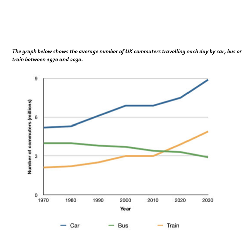
The line graph compares the daily workers in the UK using three forms of transport car, bus, and train every day over a period of 60 years.
Overall, the number of car users is the highest throughout the period shown. While the amounts of people who use cars and trains grew steadily, the number of bus users dropped gradually.
In detail, there were 11 million people who regularly travel by car, bus and train in 1970; half of that was from car users and one-fifth from bus users. Over the following 30 years, workers travelling by car and train increased by around 2 million and 1 million respectively, before remained unchanged between 2000 and 2010. By contrast, commuters travelling by bus had gone down from around 4 to 3,5 million.
In the next 30-year, cars had a peak at approximately 9 million, followed by trains that grew by more than 60% from 3 to 5 million. However, buses declined significantly by a third, from 3,5 to 3 million.
Top answer
The line graph compares the daily workers (wrong phrase. A "day laborer" is someone who is paid by the day. Often they are manual workers who dig a ditch for one day, and have to find a different job the next day.
- The line graph compares the daily workers (wrong phrase.
- A "day laborer" is someone who is paid by the day.
- Often they are manual workers who dig a ditch for one day, and have to find a different job the next day.
- These workers are not being compared.
- ) in the UK using three forms of transport car, bus, and train every day over a period of 60 years.
Get the Weekly English Kit 📬
New words, one handy idiom, and a 2-minute quiz — delivered to your inbox to keep your streak alive.
The line graph compares the daily workers (wrong phrase. A "day laborer" is someone who is paid by the day. Often they are manual workers who dig a ditch for one day, and have to find a different job the next day. These workers are not being compared. What is on this graph?) in the UK using three forms of transport car, bus, and train every
 Related Questions