
This is my Ielts writing task 1. Could you please review it? Thank you so much.
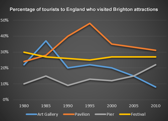
The line graph gives information about the proportion of tourists to England who went to the Art
Gallery, Pavilion, Pler, Festival from 1980 to 2010.
It can be seen that the percentage of visitors who went to Pavilion and Pier increased over the
30-year period. However the proportion of visitors who went to the others decreased.
In 1980, only 10% of tourists to England went to Pier compared to over 20% of them visited
Pavilion. The percentage of tourists who visited Pier witnessed a fluctuation from 1985 to 2000.
After that, this figure had a gradual increase from about 12% in 2000 to over 20% in 2010. The
proportion of tourists to the Pavilion reached a peak of nearly 50% in 1995. However this figure
decreased by about 20% in 15 years.
The percentage of tourists who went to the Festival was the highest in 1980 at 30%. However in
2010, this percentage had decreased slightly to about 28%. The figure for visitors to the Art
Gallery was about 21% in 1980, then reached a peak of about 38% in 1985. However this figure
decreased significantly to under 10% in 2010.
Top answer
The line graph gives information about (Tell the examiner what is plotted on the graph. It is not "information about" something. It is a measurement that is there..
- The line graph gives information about (Tell the examiner what is plotted on the graph.
- It is not "information about" something.
- It is a measurement that is there..
- ) the proportion of tourists to England who went to the Art Gallery, Pavilion, Pl er, Festival from 1980 to 2010.
- ) It can be seen that (Delete those words.
Get the Weekly English Kit 📬
New words, one handy idiom, and a 2-minute quiz — delivered to your inbox to keep your streak alive.
The line graph gives information about (Tell the examiner what is plotted on the graph. It is not "information about" something. It is a measurement that is there.. ) the proportion of tourists to England who went to the Art Gallery, Pavilion, Pler, Festival from 1980 to 2010. (These sightseeing places are all in one town - yo
 Related Questions