
This is my final practice in line graph. Plesae help me. Thank you.
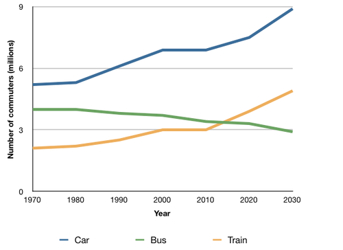
The graph below shows the average number of UK commuters travelling each day by car, bus or train between 1970 and 2030.
The line graph compares the average amount of UK commuters transport by car, bus or train between 1970 and 2030. The units are measured by millions of commuters per day.
Overall, car was consistently largest used over the period shown. The number of commuters in UK travelling by car and train rose, whereas the values for bus shrank gradually over sixty years. The curves for car and train were very similar.
In detail, the number of commuters using car for moving was by far the most, started out at nearly 5 millions and went up drammatically to reach its highest level of 9 millions. Around 4 millions of people chose bus for travelling at the starting point, but the values for bus steadily went down to 3 millions. Train had values about 3 millions less than that of car each year. It had no change in the number of all three vehicle users over the initial ten years. Train was least travelled by commuters in the UK over forty years, but rapidly overtook bus in 2011.
Top answer
The line graph compares the average number amount (Amount is for non-count items. ) ) of UK commuters transport travelling / going by car, bus or train between 1970 and 2030. The units are measured by millions of commuters per day.
- The line graph compares the average number amount (Amount is for non-count items.
- ) ) of UK commuters transport travelling / going by car, bus or train between 1970 and 2030.
- The units are measured by millions of commuters per day.
- g.
- 80 degrees Fahrenheit, 300 square meters , ) Overall, car was cars were consistently largest used more than the other modes of transport over the period shown.
Get the Weekly English Kit 📬
New words, one handy idiom, and a 2-minute quiz — delivered to your inbox to keep your streak alive.
The line graph compares the average number amount (Amount is for non-count items. Amount of water, Amount of money, Amount of rice, mount of food.) ) of UK commuters transport travelling / going by car, bus or train between 1970 and 2030. The units are measured by mill
 Related Questions