
This is my essay for IELTS Writing Task 1. Help me revise it. Thank you
The prompt is attached in this link: https://drive.google.com/file/d/1Bj8-tmUhWGhYjHL-w38o5O8-CKwQk_FD/view?usp=sharing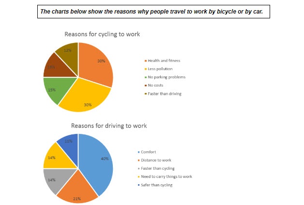
The following graphs describe people’s reasons for using two different modes of transportation: bicycle and car.
It is clear that people had various explanations for picking their means of transportation to work. Noticeably, most people travelled by bicycle due to their health, whereas another proportion of participants in the survey picked driving for convenience.
The proportion of people choosing cycling for its health benefits and clean environment was 30% equally for each. Also, half of this amount agreed that cycling resulted in little to no issues related to parking, whereas less than 2 to 3 percent believed that “no costs” or “faster than driving” accounted for their choice.
Compared to the first chart, it seems apparent that a considerable number of surveyed drivers (40%) were more certain of the great comfort from driving than its benefits for their well-being or the environment. There was nearly half of this amount confirmed their choice due to long driving distance, as opposed to 11% of drivers relying on the safety from driving. In the meantime, both the “faster than cycling” and “need to carry things to work” sector shared a similar percentage of nearly 15%.
Top answer
The following graphs (there are no graphs in this exercise. ) describe people’s reasons (How many reasons are there? ) for using two different modes of transportation: bicycle and car.
- The following graphs (there are no graphs in this exercise.
- ) describe people’s reasons (How many reasons are there?
- ) for using two different modes of transportation: bicycle and car.
- (You did not mention that this was to go to work, not just leisure or exercise.
- Your first paragraph is not very adequate.
Get the Weekly English Kit 📬
New words, one handy idiom, and a 2-minute quiz — delivered to your inbox to keep your streak alive.
The following graphs (there are no graphs in this exercise. Use the correct name of the figures, and tell the reader how many there are.) describe people’s reasons (How many reasons are there? What are they?) for using two different modes of transportation: bicycle and car. (You did not mention that this was to go to work, not just leisure or exercise. Your first pa
 Related Questions