
The last line graph pratice of mine - Thanks in advance!!
The line graph compares female birth rates per 1000 people amongst 6 various age groups from 25 to above 40 in the UK over a 35-year period.
Overall, it is clear that while women aged 25 to 29 constituted the highest figures of births, with those of the elderly whose ages are 40 and above remaning the least over the time period given.
In 1973, the per-1000-people birth rates of women in the 25-29 age group and individuals between 20 and 25 years old stood at 140 and 120, which twice as high as those of ones aged 30 to 35 and under 20-year-olds respectively. In comparison with these above-mentioned age groups, the figures of 35-to 39-year-old women and the elderly whose ages are 40 and above started at 40 and 20 respectively. While individuals between 20 and 25 years old, under 20-year-old women and the oldest age group experience a downward trend of birth rates, the rest apart from those in 25-29 age group expericend an opposite trend, with birth rates increasing for most of that time frame.
The year 1991 marked the point at which the bith rate of 35-to 39-year-old women overtook the one of those under 20 years old, standing at just above 50. During the same period, the number of births per 1000 people in women aged 25 to 29 covered at 130 after a modest decrease to 120 in 1980, then it returned again to a lower nuber of around 110 in 2000.
In 2008, There were almost a revise for the patterns of birth rates between 35-to 39-year-old women and ones under 20 years old, with the former leapt up to over 60 and the latter dipping to 40. There were a drop of around 20 births for women in 25-29 age group and and ones between 20-25 in 2008, compared with those in 1973. The number of birth rate of individuals between 30-35 moderately increase to above 80, with the rest dipping to around 10 in 2008.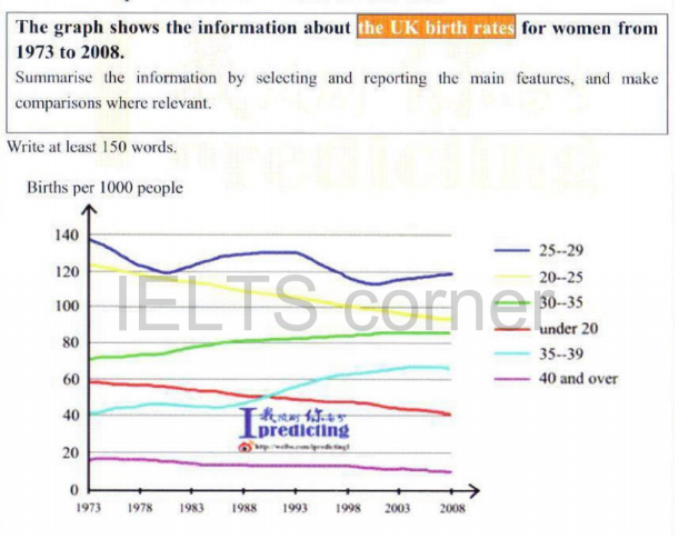
Top answer
This is a very challenging exercise. I have given you many suggestions and hope you can learn from them. The line graph compares female birth rates per 1000 people amongst 6 six various age groups from 25 to above 40 in the UK over a 35-year period.
- This is a very challenging exercise.
- I have given you many suggestions and hope you can learn from them.
- The line graph compares female birth rates per 1000 people amongst 6 six various age groups from 25 to above 40 in the UK over a 35-year period.
- ) whose ages are 40 and above remaning the least (wrong word) over the time period given.
- (This sentence has many, many issues.
Get the Weekly English Kit 📬
New words, one handy idiom, and a 2-minute quiz — delivered to your inbox to keep your streak alive.
This is a very challenging exercise. I have given you many suggestions and hope you can learn from them.
The line graph compares female birth rates per 1000 people amongst 6 six various age groups from 25 to above 40 in the UK over a 35-year period.
Overall, it is clear that while women aged 25 to 29
 Related Questions