
The graph shows the amount of fossil fuel energy generated in Europe between 1981 and 2001
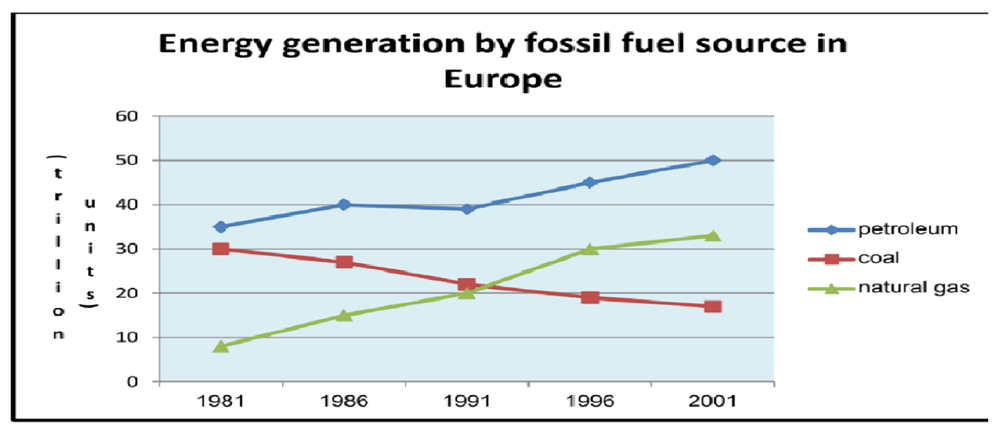
The line graph illustrates the figure of energy generation by fossil fuel source in Europe from 1981 to 2001.
Overall, it is clear that petroleum is the most of fuel source in Europe. The over period natural gas overtook coal fuel.
The amount of petroleum is 35 trillion units in 1981 and highest of energy generation source in Europe. In 1986, it was still increase to 40 trillion units and remained for 5 years. This source fuel is still strongly raise from 40 trillion to 50 trillion units from 1991 to 2001.
In 1981, the figures of coal and gas natural fuel were 30 trillion and only trillion units. However, about 10 years later the amount of natural gas source was increase in the period. While, the fuel source by coal was decline from 30 trillion to 20 trillion units and was still decrease to 18 trillion units in 2001. In addition, the fuel source was raise to 30 trillion units after about 10 years.
Top answer
Tran Thi Hoai My The line graph illustrates Illustrate is not an appropriate verb for plots or tables of data. Use it for maps, flowcharts, and diagrams. Those figures are pictures.
- Tran Thi Hoai My The line graph illustrates Illustrate is not an appropriate verb for plots or tables of data.
- Use it for maps, flowcharts, and diagrams.
- Those figures are pictures.
- "Illustrate" means "show a picture of something.
- For plots you can use compare, plot, give, show and sometimes depict.
Get the Weekly English Kit 📬
New words, one handy idiom, and a 2-minute quiz — delivered to your inbox to keep your streak alive.
Tran Thi Hoai MyThe line graph illustrates
Illustrate is not an appropriate verb for plots or tables of data. Use it for maps, flowcharts, and diagrams. Those figures are pictures. "Illustrate" means "show a picture of something. For plots you can use compare, plot, give, show and sometimes depict. For
The line graph illustrates the figure of energy generation by fossil fuel source (How many? What are they? Your information is not complete.) in Europe from 1981 to 2001.
Overall, it is clear that (Delete this dummy-it clause. It adds nothing to the essay.)petroleum is
 Related Questions