
The graph below compares changes in the birth rates of China and the USA between 1920 and 2000. Summarise the information by selecting and reporting the main features, and make comparisons where relevant.
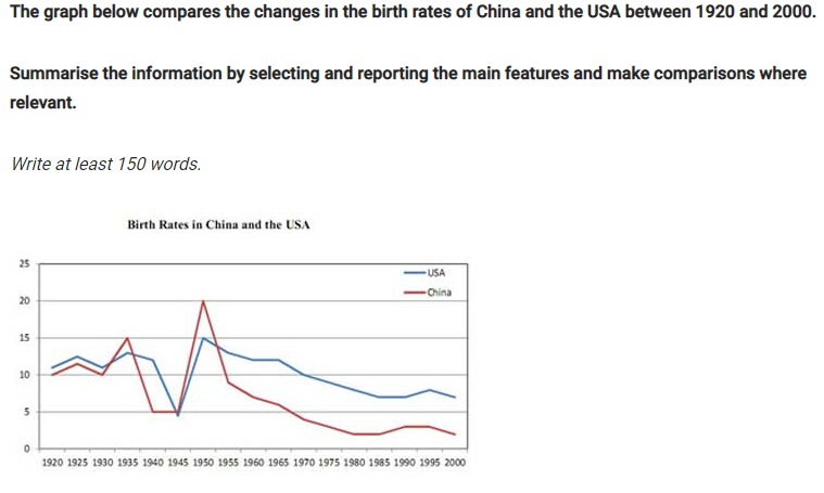
The line graph compares the birth rates of two different countries namely China and America and how these rates changed from 1920 to 2000.
Over, it is clear that the birth rates of the two nations decreased over the period of 80 years. Although both trends were similar in terms of the general decline, the birth rate of the USA in most years was higher than that of China.
In the 1920 – 1935 period, the American birth rate fluctuated even though it always remained above 10%. However, in the following decade, America saw a sharp fall in the birth rate to about 5%. In the 1950s, the figure for the USA increased significantly and reached its highest point at 15% over the 80-year course. Through the remainder of the period, a gradual decrease of roughly 8% was seen in the American birth rate by the year 2000.
Over the same period, the birth rate in China varied more significantly than in the USA. From 1940 to 1945, the figure for China stayed the same at exactly 5% before reaching the highest peak of the line chart which was 20% in 1950. By contrast, 5 years later, the birth rate of China saw a rapid drop to just under 10% and continued to fall gradually to approximately 2% in 2000.
Top answer
Where did you get that question? Did it not explain what the numbers on the vertical axis represent?
- Where did you get that question?
- Did it not explain what the numbers on the vertical axis represent?
Get the Weekly English Kit 📬
New words, one handy idiom, and a 2-minute quiz — delivered to your inbox to keep your streak alive.
Where did you get that question? Did it not explain what the numbers on the vertical axis represent?
 Related Questions