
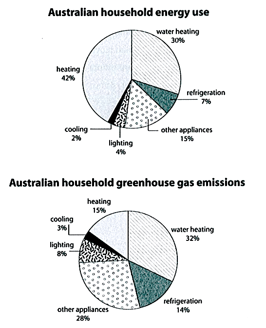
The first chart below shows how energy is used in an average Australian household. The second chart shows the greenhouse gas emissions which result from this energy use. Summarise the information by selecting and reporting the main features, and...
Hi guys, I'm so glad if you can spend time taking a look and giving me some comment to this task. Thanks in advance!
----------------------
The first pie chart depicts the household power usages in Australia whereas the second one demonstrates the percentage of greenhouse gas which different kinds of energy release into the environment.
Heating, water heating and other appliances are the power that Australian residents consume the most, and also produce the highest proportion of greenhouse gas.
To begin, heating system consumes 42 percent of energy required in an average Australian family. Besides, water heating experiences a considerable proportion 30 percent, which is double larger than the usages of other appliances. Subsequently, refrigeration, lighting and cooling have a modest amount of consumption, which are 7, 4 and 2 percent respectively.
On the other hand, water heating system substantially surpasses heating to becomes the kind of energy which emits the highest percentage of greenhouse gas, took up 32 percent. The proportion of heating and refrigeration emissions both registers as half as that of water heating, while that of other appliances account for 28 percent. The proportion of refrigeration, lighting and cooling generates 25 percent in total which is almost the same amount of that of other appliances producing.
WRITE DESCRIPTION HERE
Get the Weekly English Kit 📬
New words, one handy idiom, and a 2-minute quiz — delivered to your inbox to keep your streak alive.
 Related Questions