
The charts below show the proportion of expenditure by students, on average, at one university, in 2000 and 2010. Summarise the information by selecting and reporting the main features, and make comparisons where relevant
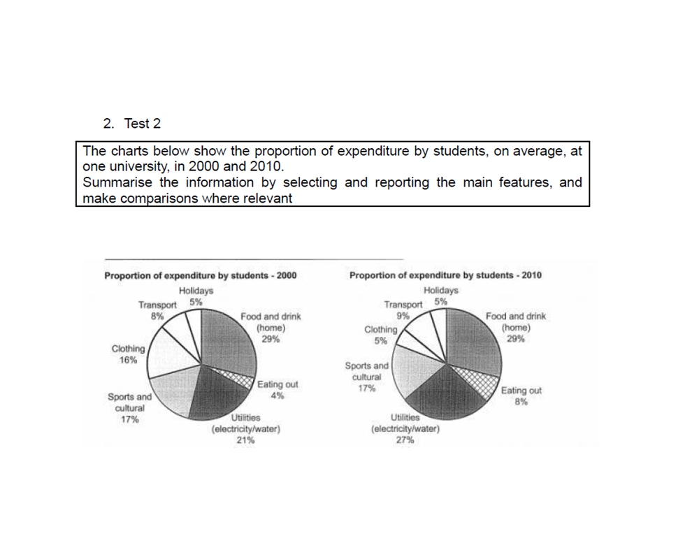
The pie charts compared the percentage of expenditure by the student on average, at a particular university in two years, 2000 and 2010.
Overall, the proportion of student’s expenditure mostly remained unchanged except for clothing, eating out and utilities changed significantly from 2000 to 2010. While the figure for eating out and utilities increased, the figure for clothing fell.
In 2000, the proportion of spending on food and drink in their home led the highest percentage with nearly a third, followed by the amount of money spend on utilities. The figure for sports and culture and also clothing was third and fourth, around 17%. Meanwhile, the percentage of expenditure for others was almost trivial at under 10%.
In 2010, the student spent 27% and 8% of expenditure on utilities and eating out in turn. However, clothing was significant decrease to 5%. Besides, the rest of the expenditure had no changes.
Get the Weekly English Kit 📬
New words, one handy idiom, and a 2-minute quiz — delivered to your inbox to keep your streak alive.
 Related Questions