
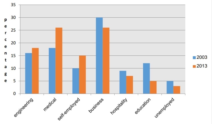
The chart shows the percentage of the adult population employed in different categories in 2003 and 2013
The bar chart compares the proportion of adults employed in seven sectors: engineering, medical, self-employed, business, hospitality, education and unemployed in 2003 and 2013.
Overall, the percentages of population of engineering, medical and self-employed went up, while the figures of the remaining sectors witnessed the opposite trend.
In 2003, the data of engineering was 16 percent compared to 18 percent in 2013. After 10 years, the figure of the medical sector rose by 8 percent. For the self-employed category, the difference between 2003 and 2013 was 5 percent.
On the contrary, the population proportion of business in 2003 was highest of all (30 percent) and this reduced to the same as the medical sector. The figures of hospitality and education dropped by 2 and 7 percent respectively, whereas the rate of the unemployed category decreased to reach 3 percent in 2013.
WRITE DESCRIPTION HERE
Top answer
Please do not put the essay instructions in the "Subject" line. Put it with your answer in the message body. Subject: Please review my IELTS essay Message body: Topic: The chart shows the percentage of the adult population employed in different categories in 2003 and 2013 What are the rest of the instructions?
- Please do not put the essay instructions in the "Subject" line.
- Put it with your answer in the message body.
- Subject: Please review my IELTS essay Message body: Topic: The chart shows the percentage of the adult population employed in different categories in 2003 and 2013 What are the rest of the instructions?
- Please post all the essay instructions.
- ) ---------------------
Get the Weekly English Kit 📬
New words, one handy idiom, and a 2-minute quiz — delivered to your inbox to keep your streak alive.
Please do not put the essay instructions in the "Subject" line.
Put it with your answer in the message body.
Subject: Please review my IELTS essay
Message body:
Topic: The chart shows the percentage of the adult population employed in different categories in 2003 and 2013 What are the rest of the instructions? Please post all the essay instr
Your text contains only 144 words. The minimum is 150 words. Your score will be decreased by one band.
The bar chart compares the percentages proportion of adults employed in seven sectors: engineering, medical, self-employed, business, hospitality, and education and
 Related Questions